Is Your Logo Working For You or Against You?
As a business owner, you probably already know the importance of employee buy-in.
Camaraderie, cohesion, and consistency are what keep businesses moving forward in a positive way. Your mission statement can absolutely create employee buy-in. But, if your logo doesn't reflect your mission, and it's at the core of your brand presence, it's actually working against you.
Think about your most passionate employees - why are they there? I would bet it's because they believe in your mission. And because of that, they have a tendency to bring team members together. They have an uplifting presence. They make others want to show up and do the work. They make the space more enjoyable.
Your brand identity can do that too.
It can communicate your mission to your team and bring them together. It can draw new team members to you. It can land new donors or clients. A strategically designed logo does this by communicating non-verbally exactly what you do and why you do it. When people see it (including you) it should evoke a specific emotion.
How do you figure out if your logo represents your mission? There are objective and measurable methods that I use at Say When to check this:
- Core Values and their Visual Translations
- Industry Alignment and Differentiators
- Audience Personas
- Psychological Profile
- Concept and Rationale
Core Values and their Visual Translations
Are your core values visually present in your logo? Can someone look at it and guess what they might be? It doesn't need to communicate every core value, but it should communicate at least two. This can be hard to determine from an owner perspective.
I find that it's best to simply ask an objective third party (someone who's not an employee or volunteer) what they think of the logo. Ask what they think it means, what it represents, and write it down. Asking one person is great, but asking ten is even better. The more outside perspectives you can gather, the easier it will be to identify commonalities. If those commonalities aren't close to your core values, then it's time to rebrand.
Industry Alignment and Differentiators
When donors and patrons make a decision to choose your organization over another, they are comparing you to your industry peers. It's important that your logo both fits in and stands out. That may sound counterintuitive, but I promise it's possible. You want it to feel like it belongs in the industry, because this lends credibility and promotes trust. People tend to ignore brands that stand too far out, thinking "they must not know much about this industry". At the same time, you want your logo to stand out from others so that it doesn't get lost. So that it grabs attention from the people it should.
Check Your Logo
The easiest way to check where you logo stands is by placing it in a line up, side by side, with competitor or industry peer logos.
What are the similarities? What are the differences? If your logo isn't fitting in or standing out in a meaningful way, it's time to rebrand.
Audience Personas
In this same vein of logic, how does your audience compare your logo to the logos they interact with on a daily basis? This is where stereotypes come into play, and while they most often have to do with age groups or generations, they can be made up of many socio-economic factors.
Does your logo make sense in the line up of logos your audience interacts with daily? Would they purchase things with your logo on it?
If so, is it because they like the aesthetic and would proudly display it, or would they purchase to support your mission but leave it tucked away?
Your logo should resonate with your audience, and this is what I mean by standing out in a meaningful way. When your logo resonates with your audience, they will proudly display it and help drive your mission forward.
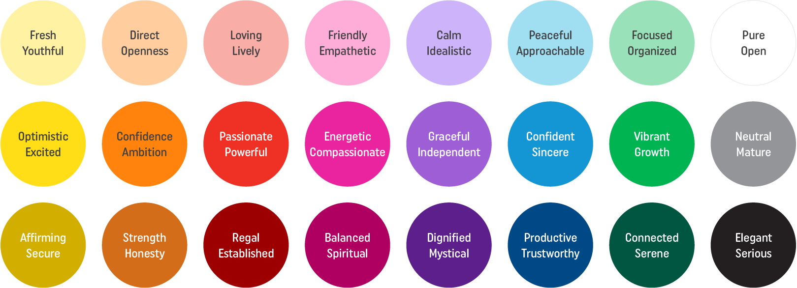
Psychological Profile
When it comes to the Psychological Profile, I rely heavily on color. Color imparts emotion on a subconscious level. Here's a color chart showing what I mean, but do keep in mind these are general emotions and they are tied to geographic location and culture. These are tied to the United States, and reflect the culture of this country. If you're located elsewhere, take some time to research the meaning of colors in your culture.
In that same vein, let's say you're based in the US, but you serve globally. How do you know which culture to represent if the colors have different meanings? Well, the easiest way is to choose the color scheme that aligns with your primary audience, and where they are located.
Are the colors in your logo in alignment with your mission? If not, which colors would be in alignment?
Typography also has emotional resonance. Letterforms, or the forms that compose each letter, are designed to be cohesive. Within a font, there are similarities between letterforms.
For example, the o, p, d, and g all have circular forms, and the creator likely used the exact same circle to craft each letter, establishing a “type rule” for the font. The shape of that circle carries emotion. Perfectly rounded circles communicate orderliness, while elongated circles communicate playfulness. There are a ton of type rules, and they all combine to create a distinct personality for the font.
What are the fonts in your logo communicating? Is it in line with the personality of your organization?
Concept and Rationale
This can be the hardest to wrap your mind around, and it is a bit less objective. So let's make it realistic and talk about Apple. Their brand communicates simplicity. The logo is literally just an apple. It communicates simplicity through it's basic forms - there are no shadows or highlights, no organic edges or texture, no additional adornments. The little leaf is only there to provide absolute context that yes, it's an apple - not a tomato or a bell pepper. The logo only has what's needed and nothing more. Apple only has what's needed and nothing more. What you see, is what you get - it's simple. There's conceptual relevance for their logo.
Does your logo have conceptual relevance? Why are the forms in use? What do they convey? Does that concept reinforce your mission?
Your logo can reflect your mission, and it really should.
If you answered no or maybe to three or more of these questions, it's time to hire a branding expert and realign your brand identity.


