









Bluey
Status:
Walking my dog
Preview of the Name Rating worksheet: a scorecard for rating up to five business names on criteria like memorable, easy to spell, and easy to say.
Pick the Perfect Name
Download the Naming Worksheet for FREE

Naming a business, product or service? This is for you. Keep it objective - score your top 5 choices across 11 categories, using this ranking scorecard. The highest scoring name is likely the best bet.

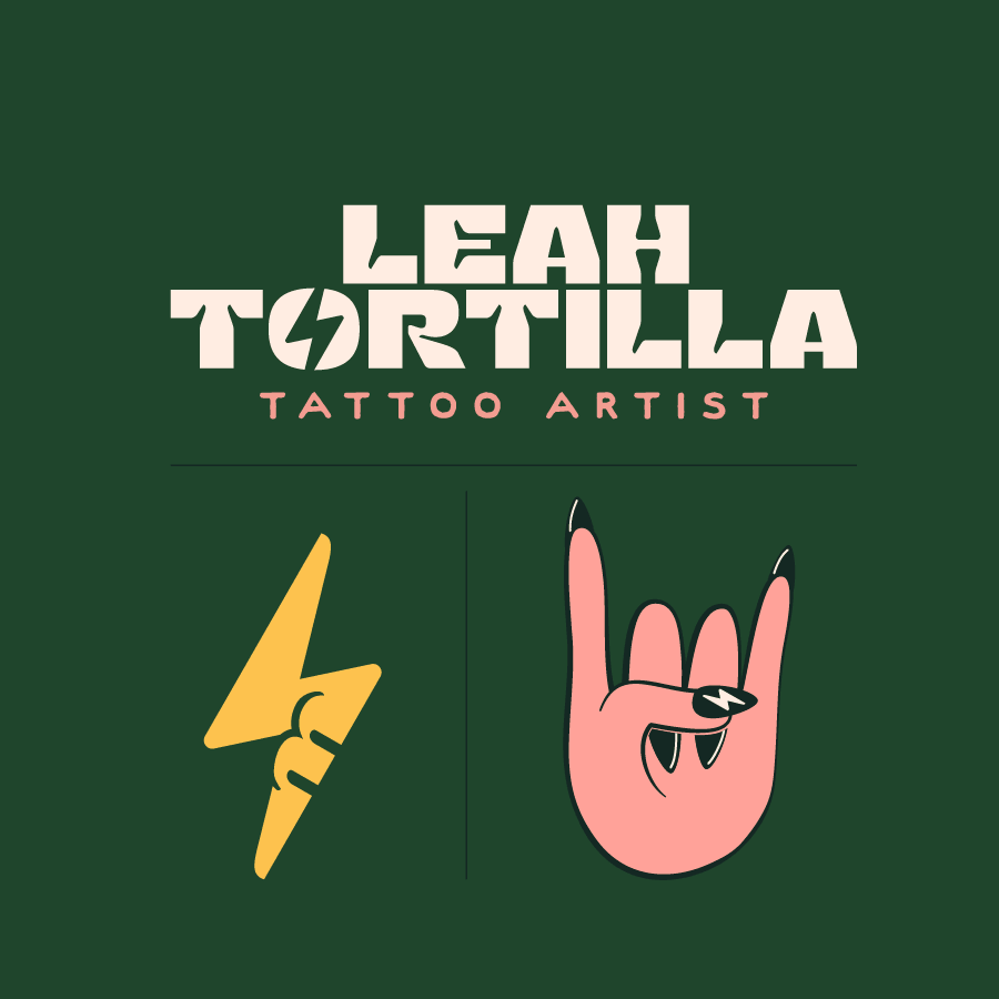
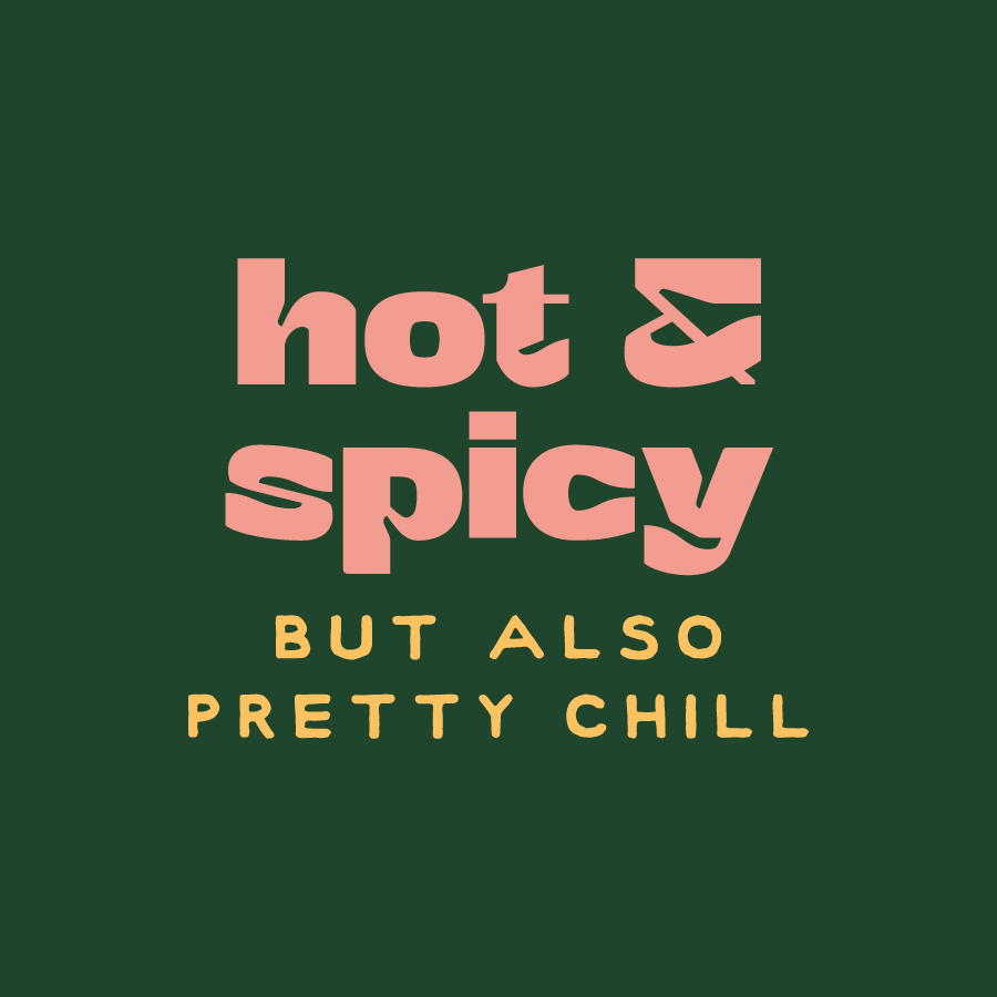
The Leah Tortilla 43 brand mark is a lightnight bolt made up of Leah's initials, LM, it also resembles a 43 with creative negative space cut-outs6 colors - Dark Green, Green, Orange, Yellow, Pink, and WhiteA mesmerizing pattern against a dark background, it's made up of organic and varying line widths that create the complex pattern. It feels mysterious.the fonts are playful and decorative, reading 'Hot & spicy'. A handmade secondary font reads 'but also pretty chill'
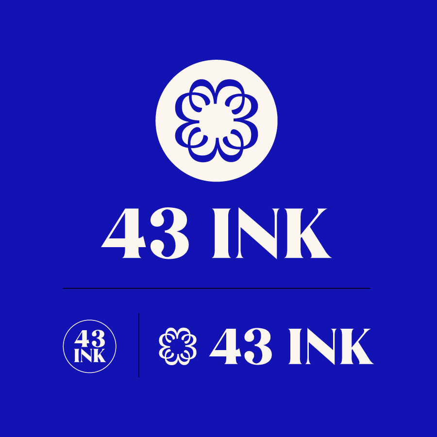
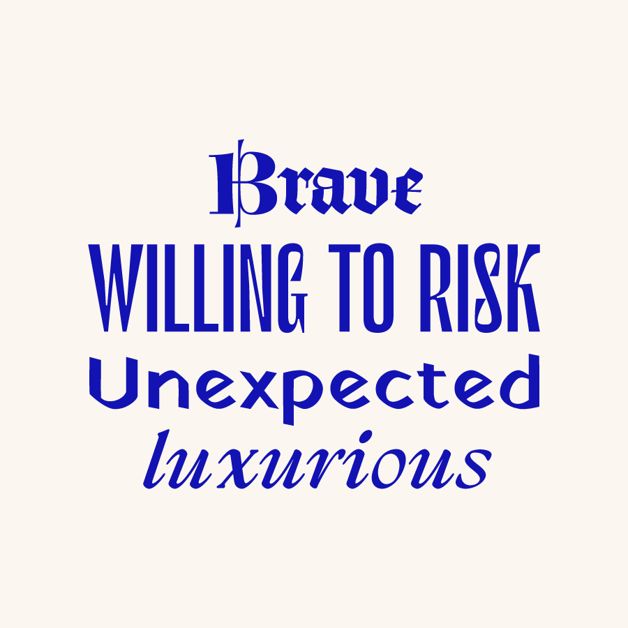
43 Ink - Logo - it's made up of 4 interlocking 3's placed on a 3x3 grid. It's both beautiful and meaningful.4 colors - Blue, Red, Pink, WhiteA digital collage depicting 'Ink Therapy', and part of a tattoo of a dragon.Fonts are sharp, tall, decorative, and italic. They read 'Brave, Willing to Risk, Unexpected, and Luxurious'
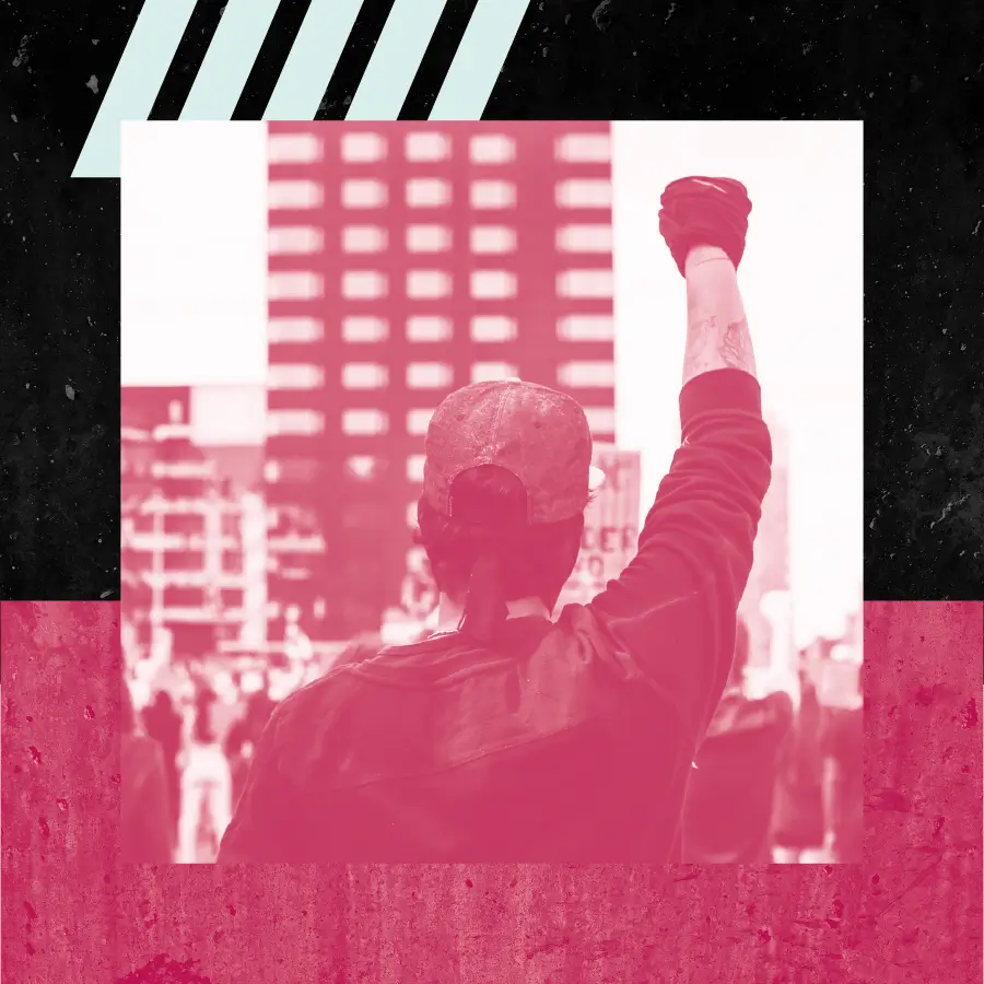
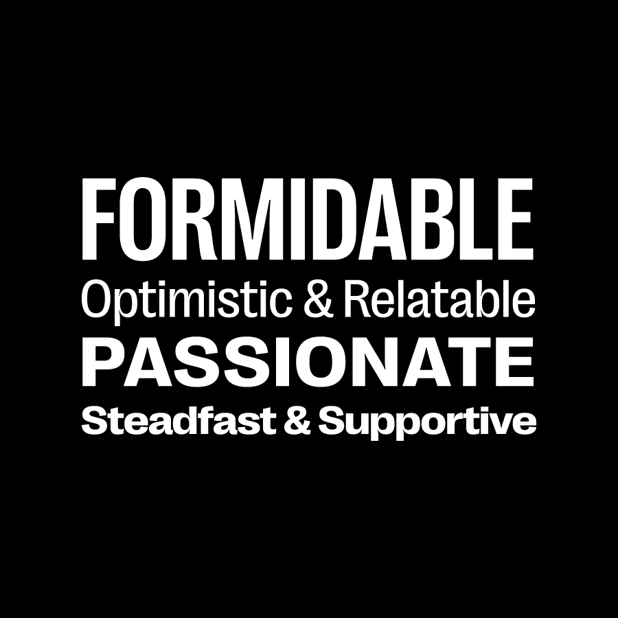
Worker Solidarity and Defense Foundation logo The W is both supporting and supported.5 colors - Black, Raspberry, Cyan, White, Pale CyanAn image in duotone shades of raspberry and white, a man with a raised fist against the city skylineThese fonts are all one family, different weights and widths. It reads 'Formidable, Optimistic & Relatable, Passionate, Steadfast & Supportive'
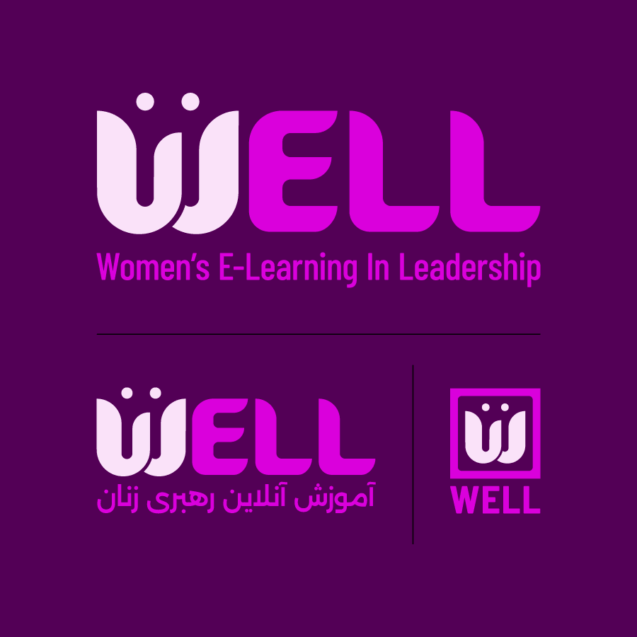
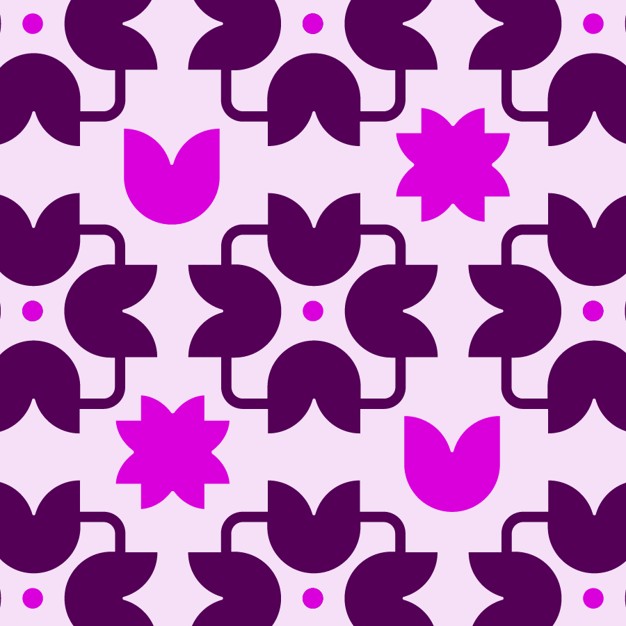
Women's E-Leadership and Learning logo - the W is made up of the Farsi character for 'woman', representing the dual citizenship of the founder3 Colors - Purple, Magenta, LavenderA pattern made from pieces of the logo, but representing a decorative hand painted tile Rounded and slab serif fonts read 'Collaborative, Multi-Lingual, Objective'
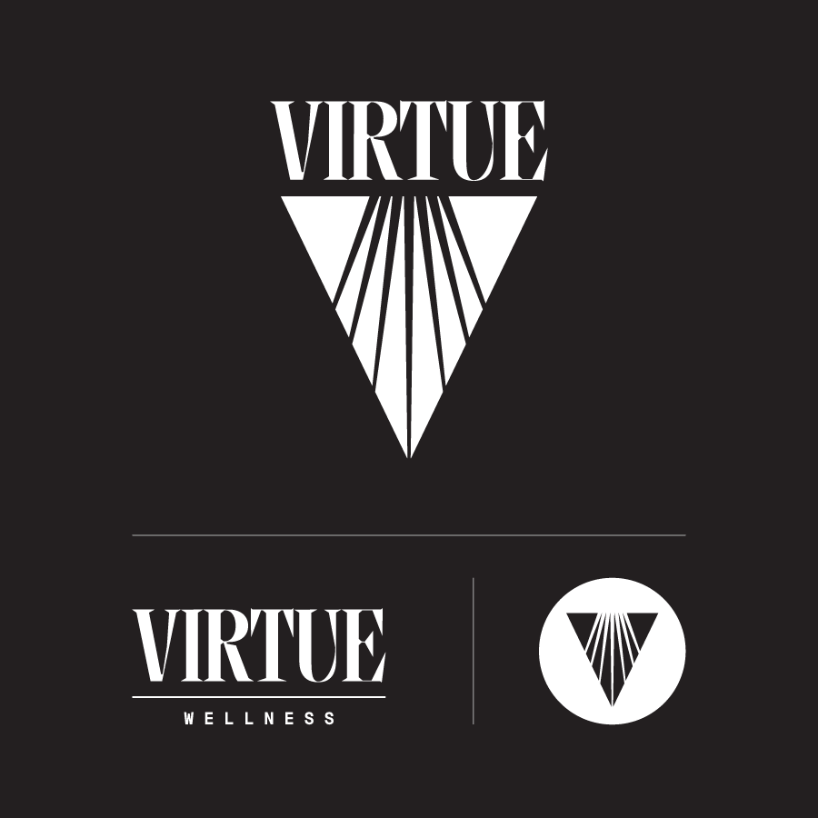
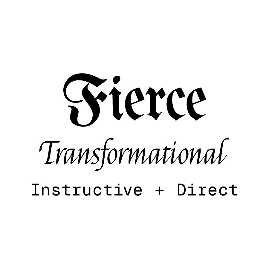
Virtue Logo - an inverted triangle with cutouts depicting pathways of light3 Colors - Black, White, GreyA closely cropped photo of a person's eye, they look straight up and are surrounded by iridescent rays of light.Decorative and oldstyle fonts with a mono. It reads 'Fierce, Transformational, Instructive + Direct
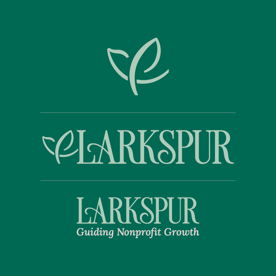
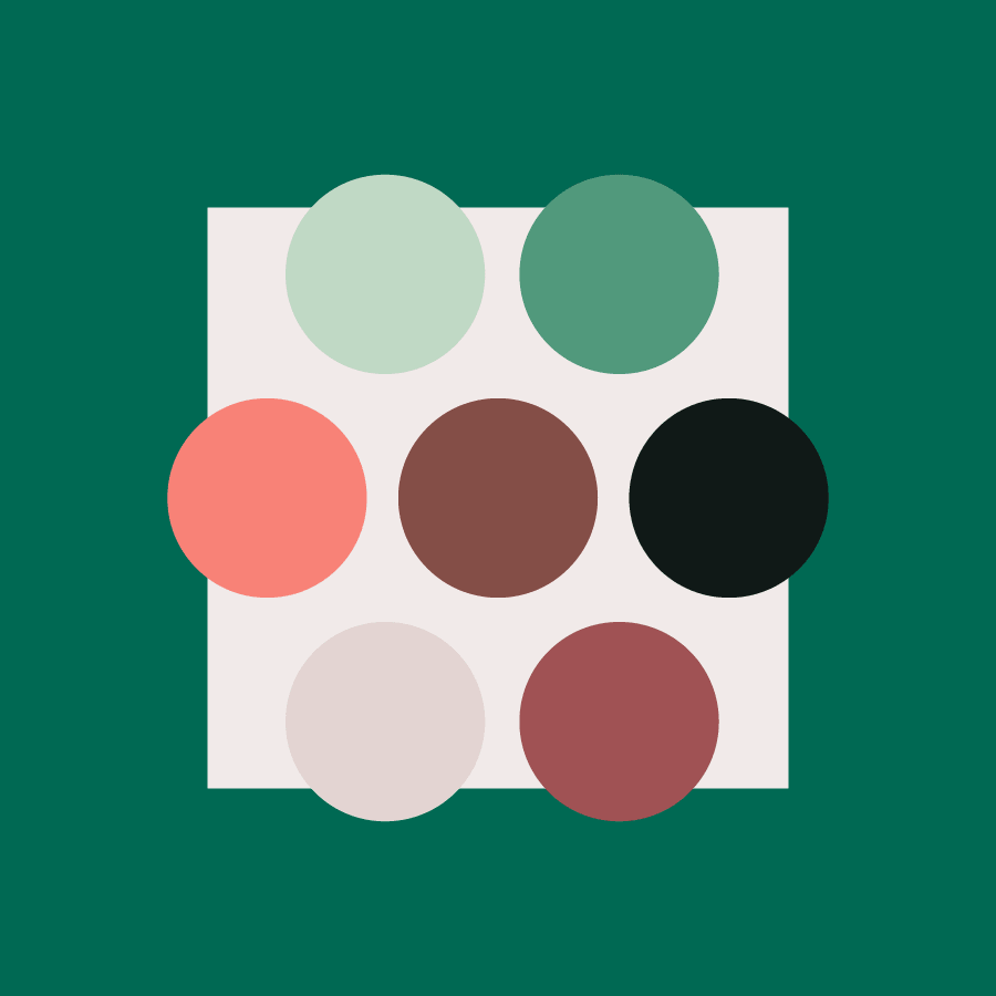
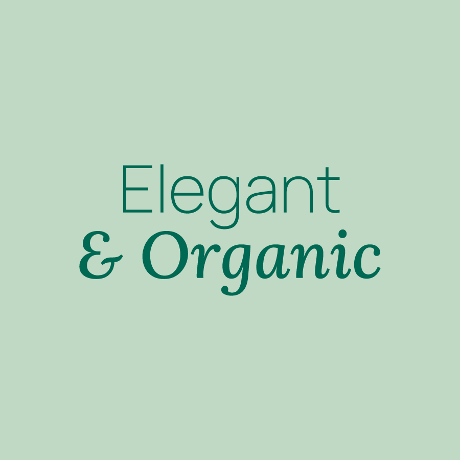
Larkspur Logo - it appears as both a bird in flight and a flower in bloom.9 Colors - Shades and tones of Green & PeachA peach color overlay on top of an image of flowers against a plain background. It's simple with negative space.Modern and no-nonsense font pairing that reads 'elegant & organic'
Friends for Hope Logo - A sun rises and shines rays of light above the words, on a badge background4 Colors - Beige, Yellow, Tan, BrownThe spot illustration from the logo of the sun shining rays of light with a color block effect, it's modern and simple. it appears as a skyline.Warm decorative font and a clean geometric sans font. They read 'Hopeful, welcoming and professional'
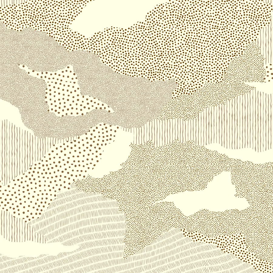
CoSpire Consulting Logo - Four C's interlock to form a pattern 9 Colors - Shades and Tints of Teal and OrangeAn irregular pattern made of smaller patterns. They're drawn with dots, lines, and markings. They mix and blend, creating a uniform texture, but a wide variety between each pattern.The modern sans pairs with a classic and charming serif. The fonts read 'compassionate & encouraging'
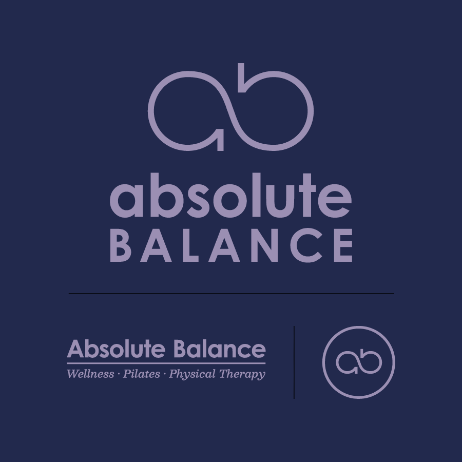
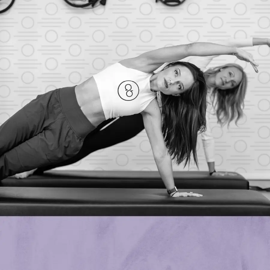
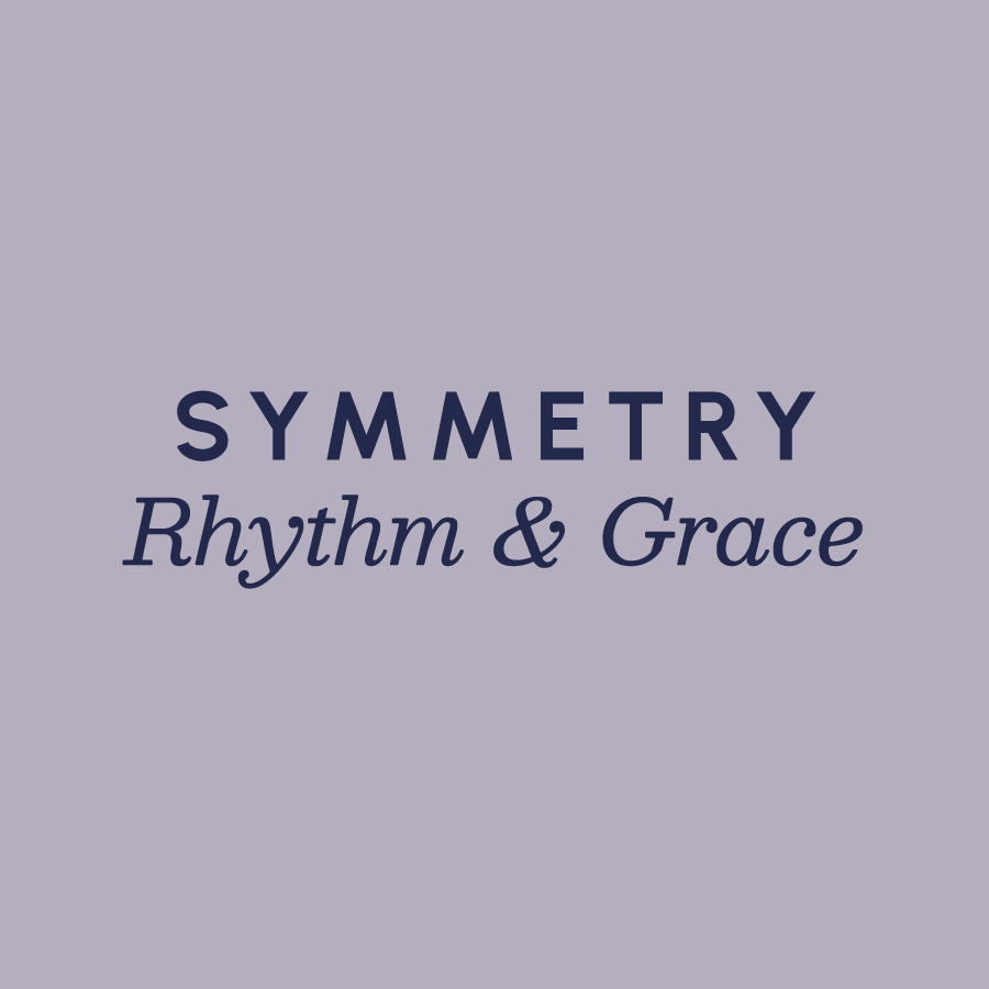
Absolute Balance Logo - Modern and Geometric, it's perfectly balancing the letters 'A' and 'B' as circular forms that nearly resemble an infinity symbol.5 Colors - Lavender, purple, navy, beige, greyA black and white image of women doing pilates, with a color block along the bottom showing textured lavenderThe fonts are clean, modern and timeless. They read 'symmetry and rhythm'

Brand & Web for Purpose LedTM  

Brand Identity + Web Design for Nonprofits, Small Business Owners, and purpose driven folx.

Explore Branding
Portrait of Hannah Zachry

Hello!

I’m Hannah Zachry, the Social Impact Designer behind Say When. I'm a Certified Brand Strategist and I hold a BFA in Graphic Design, with a minor in Photography, from The School of Design at UCO. You can read more about me on this site if you'd like.

Value Driven Studio

Say When is for purpose driven brands. Society is imbalanced and so many systems are broken. That's why I work with folx who disrupt, alleviate, educate, advocate, and/or create. People who are working towards something better for their communities, and share many of the values I hold:

◘ Equality

Everyone has a seat at the table. I respect, uplift, and make space for every voice. I work with purpose to help bring balance where there is inequality, because injustice anywhere is a threat to justice everywhere.

Fuck Fascism

◘Curiosity  

There’s always more to learn! I ask ‘why’ and ‘how might’ questions frequently. Exploring how ideas and concepts are transformed into visual, verbal, and interactive experiences is my playground.

Just Keep Going!

◘Empathy

Empathy is essential to the branding process because it's all about guiding people to specific emotions, thoughts, and actions. Empathy begins with understanding, and leads to better relationships.

Vulnerability Makes Us Stronger

◘Vitality

Purpose-led folx are often Caretakers: those who tend to give too much, overwork, and de-prioritize their own needs. Society tends to belittle the idea of "taking a break" and self-care can be seen as weak or lazy, which is complete bullshit.

Vitality is the foundation from which we can give, it should be respected and valued.

Self-Care Makes Caring for Others Possible

Branding & Re-Branding Examples
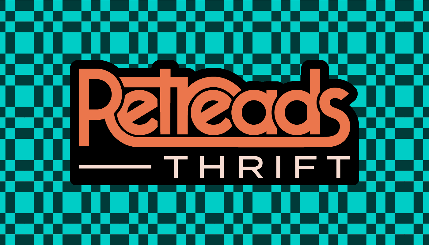
Retreads Thrift by Hope is Alive
Identity Design + Branded Collateral
View
CoSpire Consulting
Identity Design + Website Migration
View
Larkspur
New Brand & Website Design
View
All Case Studies

Work Ethic Statement

At Say When, creative work is rarely or never outsourced, generated by Ai, or tailored to a trend. I believe that authenticity is the brand strategy, so together, you and I will frame everything around who you are, what you do, and why you do it.

Bring your passion and purpose, and I'll Visually TranslateTM it so that people see it, feel it, and believe it.

Creative Services

Say When helps Nonprofits and Small Businesses stand out + do more. As a Social Impact Designer and brand strategist, I create custom logos, easy-to-manage websites, and on-brand storytelling that help you stand out. Need design help every month? My fractional support has you covered.
Brand Identity Design

Brand Messaging

Custom Web Design
Fractional Graphic Design

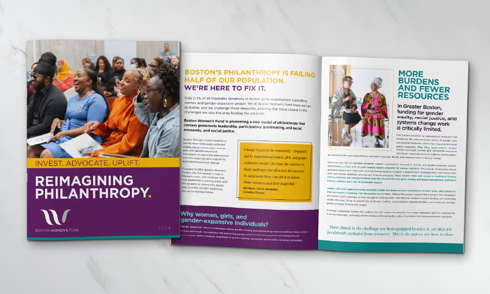
Business papers set for Teen Empower. The brand is bright and very colorful with a playful application of patterns that are hand-drawn sketches.A repeating black and white pattern that says "Retreads Thrift" with the words "HOPE IS ALIVE" in the center in a bold orange, their brand color. Next to it is an image of a person holding a branded tote bag with fun patterns and a big logo "Retreads Thrift by Hope is Alive"Two images of people overlapping slightly, with the Worker Solidarity and Defense Foundation logo overlaid on one. It's got a dark background with a concrete texture.A magazine style booklet for Boston Women's Fund titled "Reimagining Philanthropy". The cover of the booklet and a full spread are shown. The brand is applied to both creatively, with visual variety and cohesion. It looks polished and professional.Business paper suite for Larkspur - letterhead, business cards, and a notebook. Each item shows the brand in a new way, depicting birds, flowers and the logo. The brand is emerald green with a lot of negative space so it feels airy and peaceful.Book cover design for 'Yesterday's Tomorrows' an anthology by The Fiction Lab. The cover is dark, with multiple overlaid colorful lines, forming a pattern that is three-dimensional and appears like a corridor.

Client Testimonials

...a solid final product.

"Our organization, Hope Is Alive, needed unique branding for a new endeavor. Say When created a new brand that worked great, aligning with our current brand! Hannah was easy to work with, providing a quick consultation, clear next steps, and a solid final product."

Zach Divilbiss
Creative Director at Hope Is Alive
She stepped and hit the ground running...

"She stepped and hit the ground running and were able to knock out our high priority projects with ease and quality. Working with Hannah was very easy and she was professional."

Katherine Newsome
Marketing Director at Variety Care
She was extremely organized, streamlined, and structured...

"Hannah helped our firm to define its brand and image in the marketplace. She was extremely organized, streamlined, and structured. I knew exactly what I was getting and I felt confident every time that the quality of work would be top notch."

Kevin Moore
Founder at Serac Ventures

Partnered With:

Ready?!

View Brand & Web Packages

Show Me the $