Client
Retreads Thrift by Hope is Alive
May 2024
Context
This project won an American Advertising Award in 2024.
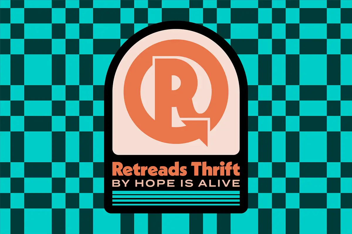
Hope Is Alive provides homes to those in recovery, helping reduce the likelihood of relapse with a support system and a safe space. Over the years, the generosity of donors has increased and led to a surplus of clothing, furniture, and housewares. The solution: open a second-hand store! Retreads is more than a place to shop, it's safe space to work. For many folks, it will be the first job in a long time and will allow them to move forward with hope.

Project Type
Identity Design + Branded Collateral
Platforms & Tools
Pen and paper, Procreate, Adobe CC, Wordpress + Elementor
Collaborators
Zach Divilbiss, Sean Fitzpatrick
Industry
Nonprofit Arm - Thrift Store

About the Brand
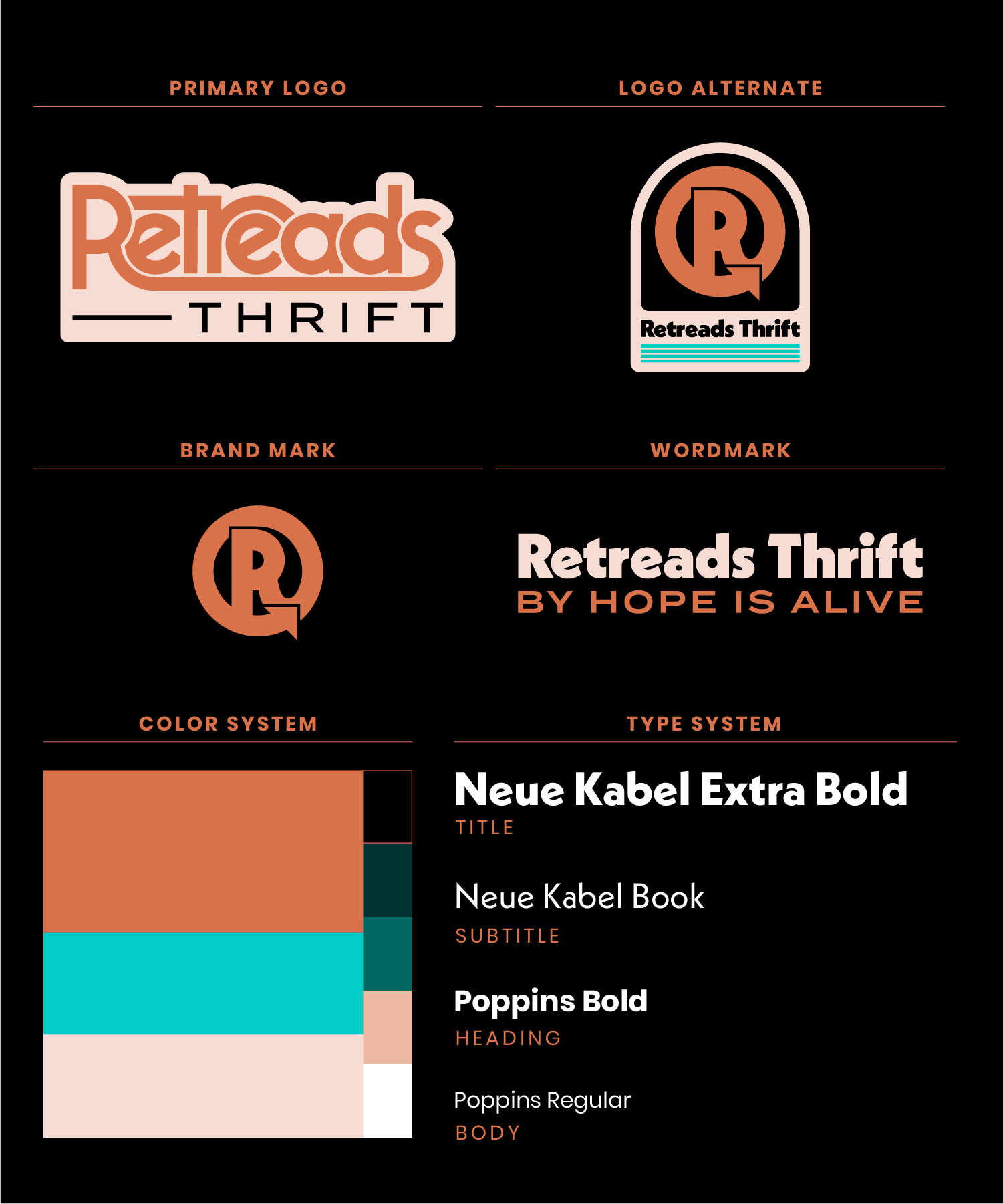
Retreads Thrift by Hope is Alive is all about the transformation from darkness to light, from old to new, from forgotten to found. Retreads needed a brand system that would both compliment the HIA brand and clearly stand out on it’s own.
Wayfinding signage, and marketing collateral were also needed to launch this new shop.
The Logos
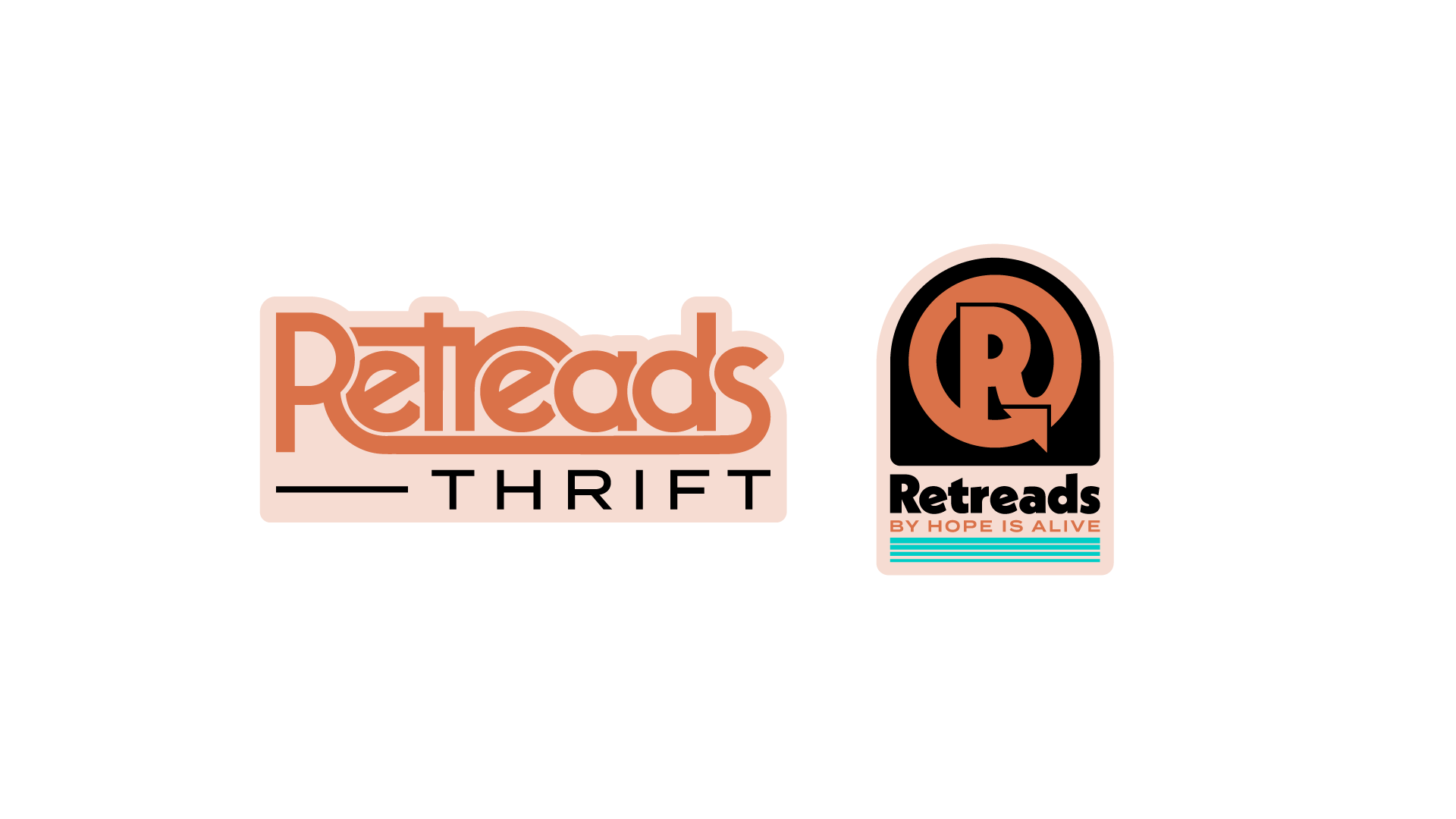
The Retreads logo system was inspired by record stores, music memorabilia, and 70's design. Their brand values are Brave, Compassionate, and Transformative.
The typography is a modern interpretation of the 70’s Bauhaus revival, coming across as familiar and welcoming to represent Compassion. The thick line weight makes a bold, brave, statement. Tight spacing and overlapping forms provide depth and interaction, just like all good conversations have. The continuous movement of the arrow represents transformation.

The Patterns
Maximalism was the move for Retreads. Bold, bright patterns were created as a motif system. They add visual interest, while also reflecting an eclectic personality - perfect for a thrift store! You never know what you'll find, but you can bet it will have personality.
The Brand Match
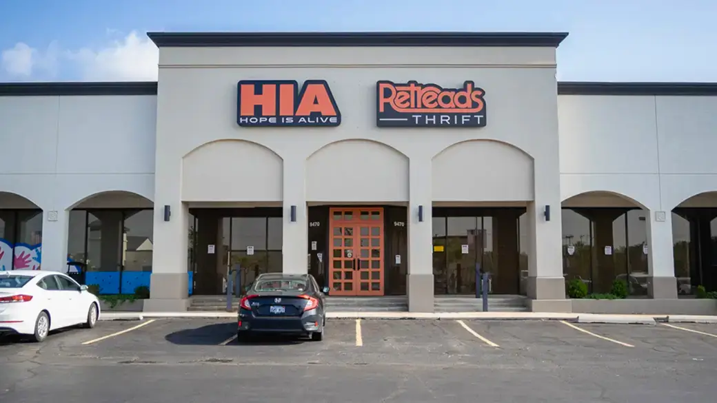
The Retreads brand identity was designed to co-exist with it's parent brand, Hope Is Alive. I used thick letterforms and the same supporting typeface to bring these two brands together. Additionally, the colors in the Retreads brand were all mathematically created from the HIA color palette.
See Another?