Client
Worker Solidarity and Defense Foundation
Dec 2024
Context
The Worker Solidarity & Foundation was founded in November of 2024, in direct response to the unfair labor practices held by some of the nation's largest employers like Amazon and Starbucks. Unreasonable hours, expectations, pay rates, and advancement opportunities keep the working class from rising up and building a life of leisure.
Project Type
Identity Design + Branded Collateral
Platforms & Tools
Pen and paper, Procreate, Adobe CC
Collaborators
Brand Designer + Muralist
Industry
Nonprofit - Labor Law, Collective Action
About the Brand
WSDF needed a brand identity that would inspire hope for workers who have unionized, and strike fear into those who oppose their union. The brand identity would need to serve both audiences, in very different ways which was a unique challenge for me to solve! And you know I love challenges.
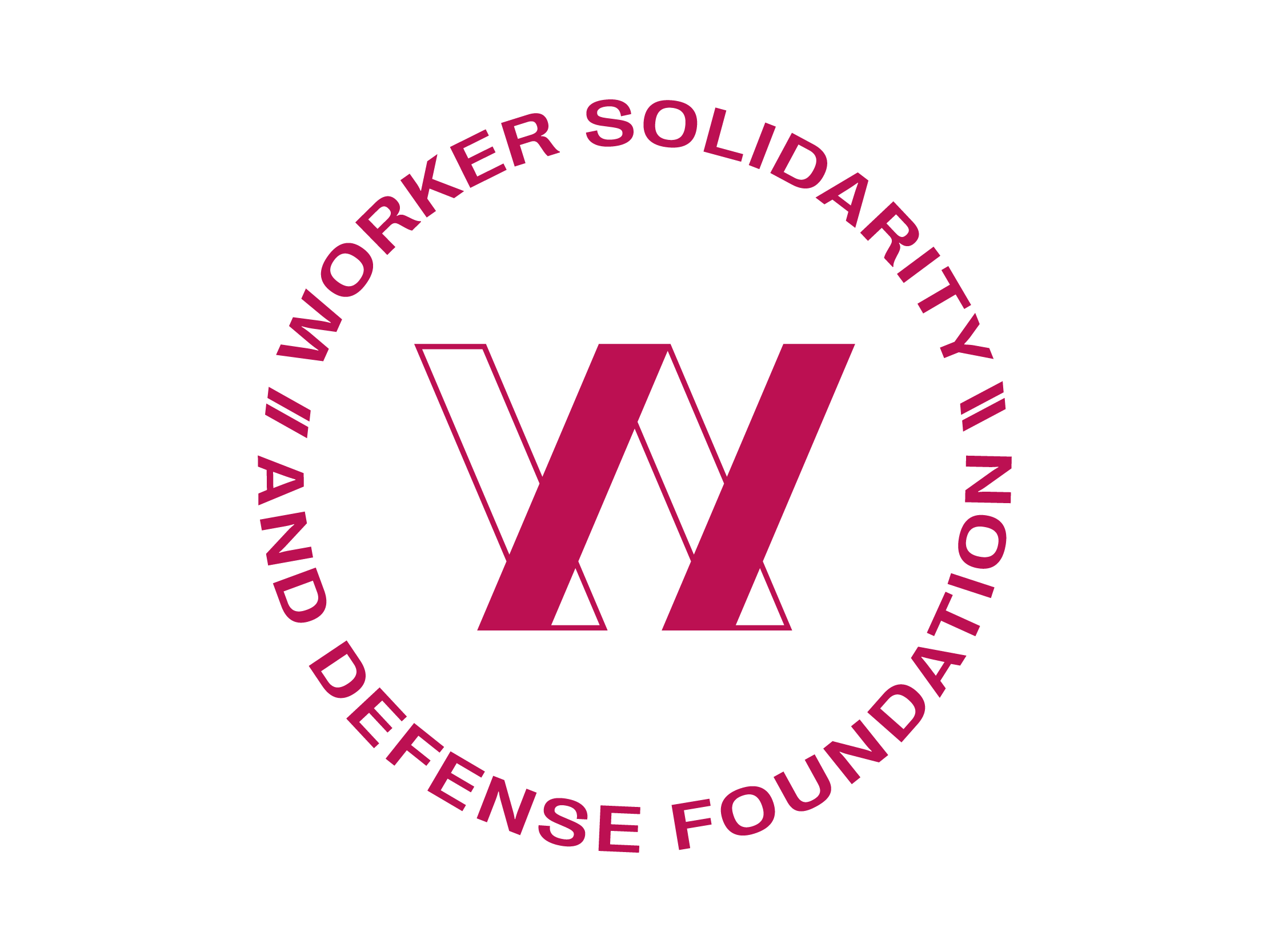
The concept for this brand: Immovable.
I worked with Haley Spradlin on the concept sketches and what's wild is that we both came up with this concept separately! While our sketches were a little different, the idea was the same: standing together.
The interlocking and overlapping forms visualize Empowerment and Solidarity, as they are four distinct elements standing together.
I used a structured grid to visualize Justice and Commitment, and heavy strokes and thick forms visualize Respect.
Color Story
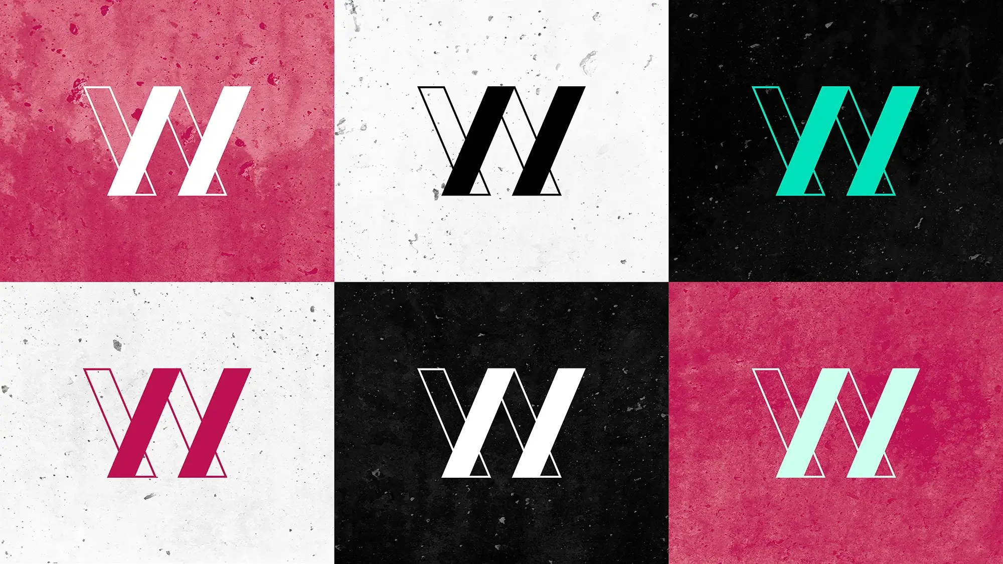
Color is one of the most important ways an organization conveys their identity. And, it's not just the hues themselves, but the amount of hues.
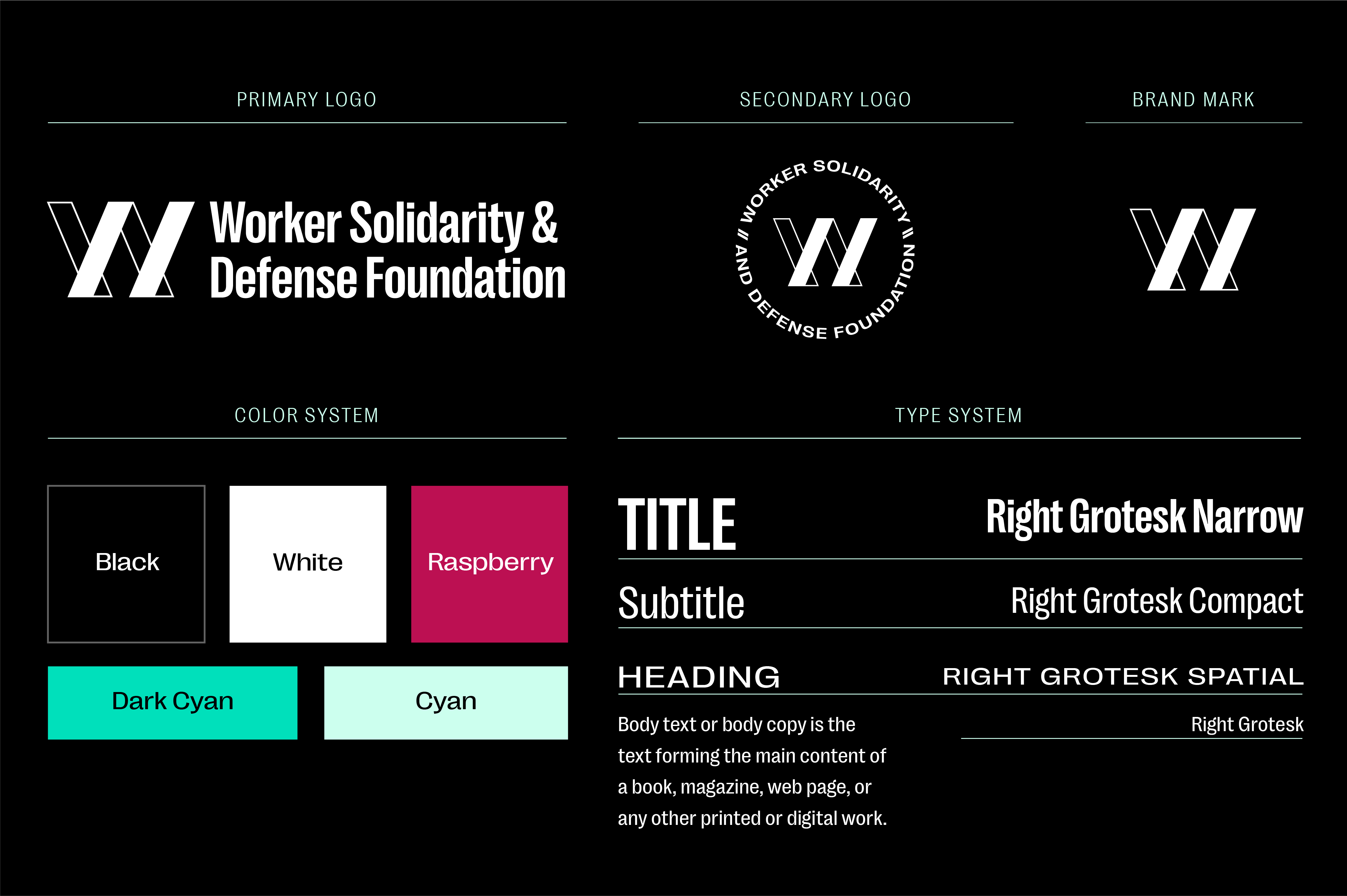
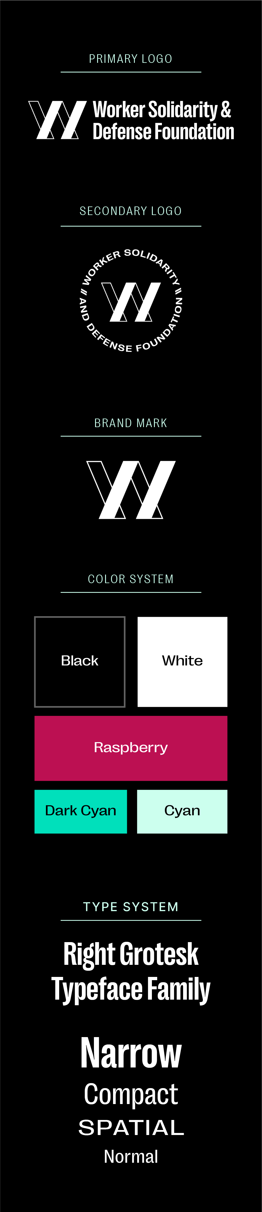
Using a limited color palette, with 1 primary pop of color reinforces the idea of strength and solemnity. I chose to use a primarily Black and White palette with pops of Raspberry to show that WSDF is formidable. They cannot be easily persuaded, and they will hold fast. Cyan and Dark Cyan come in to play rarely, and are for instances in which the brand needs additional colors to distinguish ideas.
Motif Design
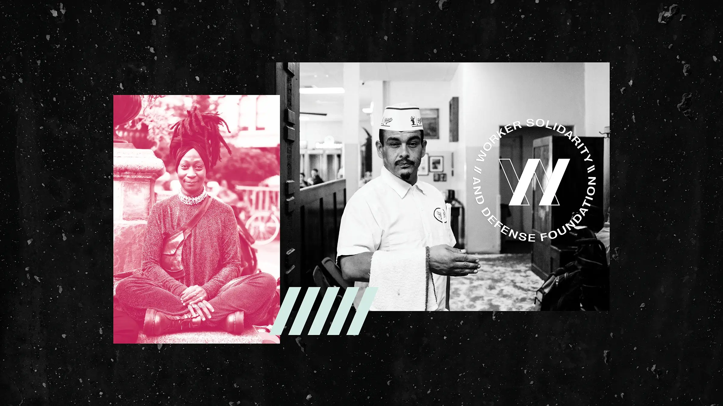
I designed three accents for the brand, aka brand motifs.
First, I used a concrete texture pack to convey Grit and Tenacity. Then, I used a high contrast duotone photo treatment to visualize Empowerment. Last, I created a motif from the brand mark itself, pulling the slanted shape to represent Solidarity: standing together.
See Another?