Bluey
Status:
Walking my dog
Site under construction: please excuse bugs!

Branding

Strategy & Identity Design

Logo Design

I create logo systems with various lockups for different use cases. They are designed to be cohesive, conceptually relevant, aligned to a grid, and optically balanced.
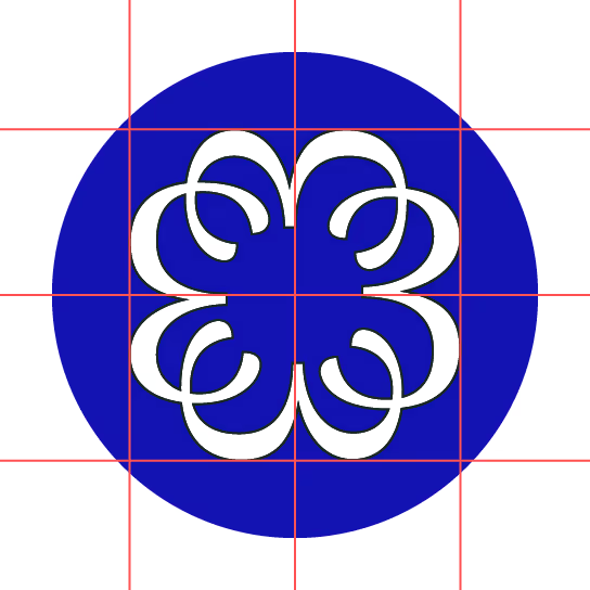
43 Ink Logo. It's 4 three's, each one rotated and mirrored to form a circular mark. It appears on a grid here, showing the proportions and careful thought.
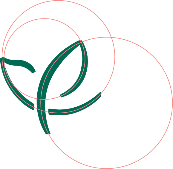
Larkspur Consulting Logo. It's a simultaneous abstraction of a bird in flight and a flower growing. It appears on a grid here, showing the proportions and careful thought.
Women's E-Learning in Leadership (WELL) Logo. It's a W shape, with two dots above it. But really, it's stylized Farsi characters that read 'woman'. It appears on a grid here, showing the proportions and careful thought.
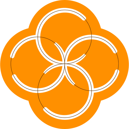
CoSpire Consulting Logo. It's a meditative, circular mark, made up of circles that flow into one another. It appears on a grid here, showing the proportions and careful thought.
43 Ink Logo. It's 4 three's, each one rotated and mirrored to form a circular mark. It appears on a grid here, showing the proportions and careful thought.
Larkspur Consulting Logo. It's a simultaneous abstraction of a bird in flight and a flower growing. It appears on a grid here, showing the proportions and careful thought.
Women's E-Learning in Leadership (WELL) Logo. It's a W shape, with two dots above it. But really, it's stylized Farsi characters that read 'woman'. It appears on a grid here, showing the proportions and careful thought.
CoSpire Consulting Logo. It's a meditative, circular mark, made up of circles that flow into one another. It appears on a grid here, showing the proportions and careful thought.

Color Story

Color carries emotion and it cultivates a mood. But, it's different for everyone: physical location, culture, and experience all attach meaning to colors for an individual. I curate a palette, with ADA compliance, Pantone swatches, and more.

The color palette for 43 Ink is a limited high contrast palette of just 4 colors. Blue, white, red, and light red. This image shows the colors overlapping as rectangles and circles.
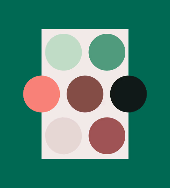
The color palette for Larkspur Consulting is a calming set of dark and light greens, with a pop of coral, peach, brown, and cream. This image shows 9 colors, overlapping as rectangles and circles.
The color palette for WELL is three shades purple. This image shows each one, overlapping as rectangles and a circle.
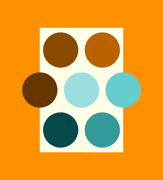
The color palette for CoSpire Consulting is a full complementary set of oranges and teals. This image shows 9 colors, overlapping as rectangles and circles.
The color palette for 43 Ink is a limited high contrast palette of just 4 colors. Blue, white, red, and light red. This image shows the colors overlapping as rectangles and circles.
The color palette for Larkspur Consulting is a calming set of dark and light greens, with a pop of coral, peach, brown, and cream. This image shows 9 colors, overlapping as rectangles and circles.
The color palette for WELL is three shades purple. This image shows each one, overlapping as rectangles and a circle.
The color palette for CoSpire Consulting is a full complementary set of oranges and teals. This image shows 9 colors, overlapping as rectangles and circles.

Typography

Type, like color, carries emotion. I curate a selection of fonts that fits your budget. If I can't find it, I create it. I've developed a handful of typefaces over the years, and it's one of my favorite things to do!

Typographic sample: "Brave" is set in a medieval blackletter font; "Willing to Risk" is set in a tall, high-contrast, decorative sans serif font; "Unexpected" is set in a high-contrast, decorative humanist font; "luxurious" is set in an italic, antique, serif font.
Typographic sample: "Elegant" is set in a thin grotesque sans serif font; "Organic" is set in a classic italic serif font.
Typographic sample: "Collaborative" is set in a rounded, geometric sans serif font; "Multi-lingual" is set in all caps, with wide letter-spacing in the same rounded, geometric sans serif font; "Objective" is set in a classic slab serif, with mono-weight proportions.
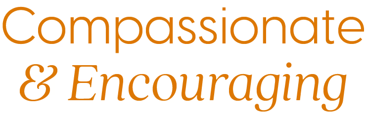
Typographic sample: "Compassionate" is set in a rounded, geometric sans serif font; "Encouraging" is set in a cozy italic serif font.
Typographic sample: "Brave" is set in a medieval blackletter font; "Willing to Risk" is set in a tall, high-contrast, decorative sans serif font; "Unexpected" is set in a high-contrast, decorative humanist font; "luxurious" is set in an italic, antique, serif font.
Typographic sample: "Elegant" is set in a thin grotesque sans serif font; "Organic" is set in a classic italic serif font.
Typographic sample: "Collaborative" is set in a rounded, geometric sans serif font; "Multi-lingual" is set in all caps, with wide letter-spacing in the same rounded, geometric sans serif font; "Objective" is set in a classic slab serif, with mono-weight proportions.
Typographic sample: "Compassionate" is set in a rounded, geometric sans serif font; "Encouraging" is set in a cozy italic serif font.

Motif System

These can be anything! Texture. Patten. Illustration. Iconography. Editing Technique. Photographic Style. Motion Graphics. These are all the things that bring life to your brand.

A decorative image for 43 Ink. It looks like a screenprinting error with the words "Ink Therapy" distorted and difficult to discern. An illustration of a claw and tail are closely cropped, with a warped texture over the entire image. It's a tone-on-tone peachy and creamy image, with lots of layers that add depth.
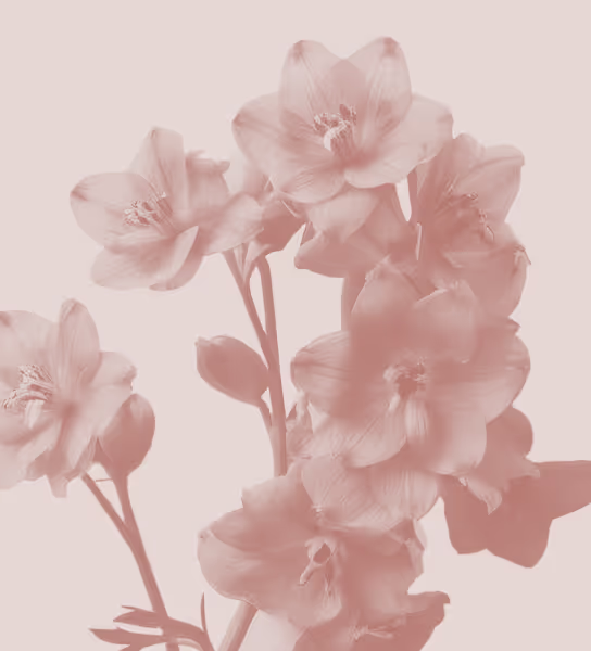
A decorative image for Larkspur Consulting. It's a minimal duotone image, peach on off white, of a delphinium flower in bloom. It has five petals and few leaves on longer stems. It's elegant and subtle. Delphinium flowers are also known as Larkspur.
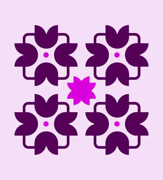
A decorative image for Women's E-Learning in Leadership. It's a light purple background with a bold, geometric tile-like pattern in dark purple, with small pops of bright purple. It is inspired by Isalamic art and motifs, but made from shapes seen in the organization's logo.
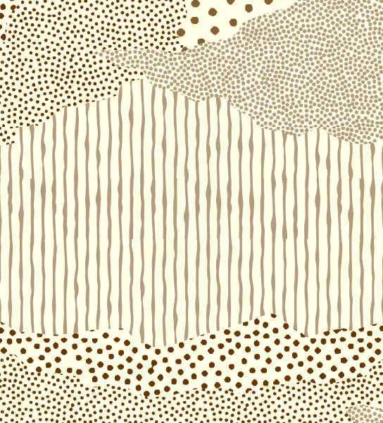
A decorative image for CoSpire Consulting. It appears to be hand drawn lines and dots, forming patterns that fill regions, kind of like a map. Except, there are no outer edges. It fills the screen, and where one pattern meets the next there is no border line, but appears irregular. It reminds me of clouds, or the way a mountain range looks from the distance.
A decorative image for 43 Ink. It looks like a screenprinting error with the words "Ink Therapy" distorted and difficult to discern. An illustration of a claw and tail are closely cropped, with a warped texture over the entire image. It's a tone-on-tone peachy and creamy image, with lots of layers that add depth.
A decorative image for Larkspur Consulting. It's a minimal duotone image, peach on off white, of a delphinium flower in bloom. It has five petals and few leaves on longer stems. It's elegant and subtle. Delphinium flowers are also known as Larkspur.
A decorative image for Women's E-Learning in Leadership. It's a light purple background with a bold, geometric tile-like pattern in dark purple, with small pops of bright purple. It is inspired by Isalamic art and motifs, but made from shapes seen in the organization's logo.
A decorative image for CoSpire Consulting. It appears to be hand drawn lines and dots, forming patterns that fill regions, kind of like a map. Except, there are no outer edges. It fills the screen, and where one pattern meets the next there is no border line, but appears irregular. It reminds me of clouds, or the way a mountain range looks from the distance.

Collateral

I design supporting branded materials for folx running campaigns, promoting events, services, and more. I help bring your brand to others, creating digital and physical collateral.
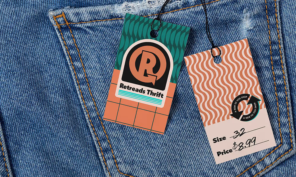
A pair of jeans with a price tag branded for Retreads Thrift by Hope is Alive. It reads Size: 32, Price: $8.99
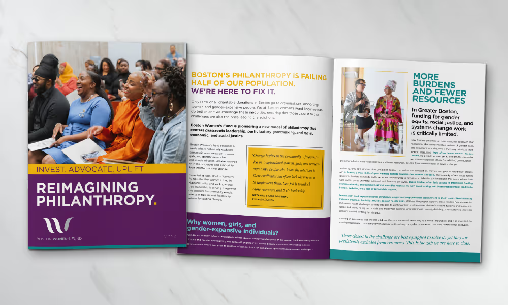
A magazine style booklet for Boston Women's Fund titled "Reimagining Philanthropy". The cover of the booklet and a full spread are shown. The brand is applied to both creatively, with visual variety and cohesion. It looks polished and professional.
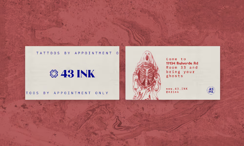
Two business cards, side by side. The  first one reads "43 Ink, Tattoos by appointment only". The second one has an illustration of a ghost opening his chest cavity to reveal a skeleton beneath. It reads "Come to 17134 Bulverde Rd Room 33 and bring your ghosts. www.43.ink @43ink"
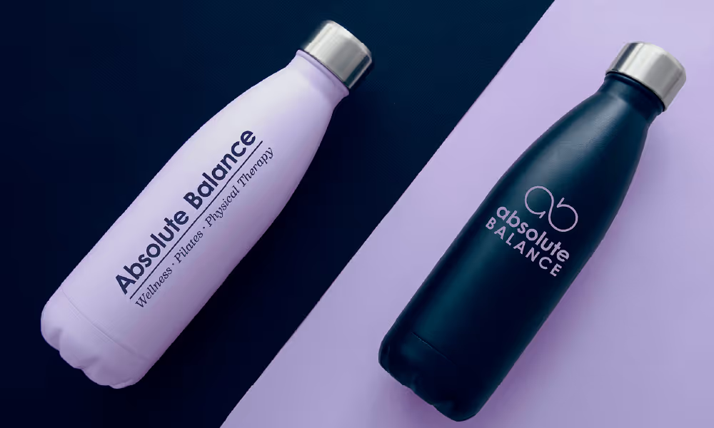
Two, high contrast, water bottle are angled in the image, with a split screen colored background. A lilac bottle on a navy background shows one logo for Absolute Balance • Wellness • Pilates • Physical Therapy. Next to it, a navy bottle on a lilac background shows a different logo for the same business.
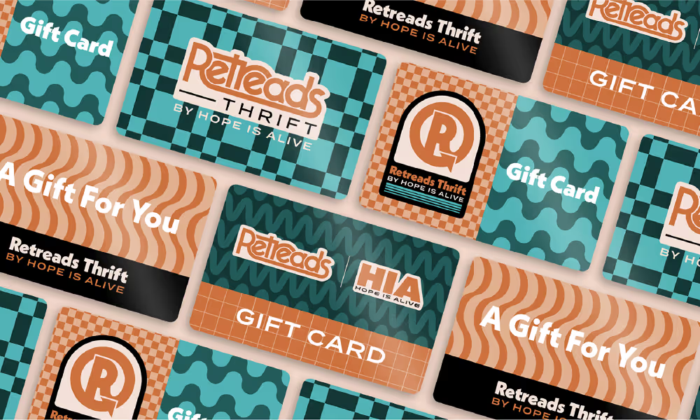
Gift card designs for Retreads Thrift Store by Hope is Alive. These are boldly designed with funky 70's patterns in a high contrast orange + teal color palette. Pops of black and white create contrast for text and brand elements.
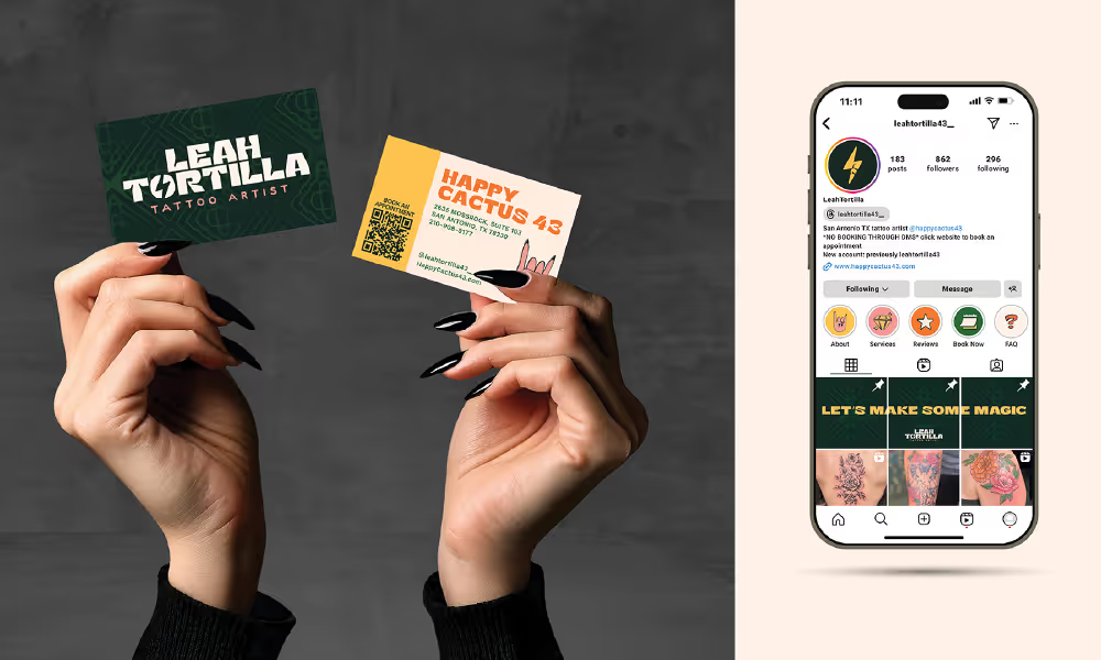
Hands with long, shiny, black nails, reach up from the bottom of the image, clad in a black sweatshirt. Each hand holds a business card for Leah Tortilla, a tattoo artist with a feminine, fun, and dark green + coral brand. It appears elevated, while funky typography brings in the fun personality. Next to this, is another image of a phone, showing the instagram profile for Leah.
Gift card designs for Retreads Thrift Store by Hope is Alive. These are boldly designed with funky 70's patterns in a high contrast orange + teal color palette. Pops of black and white create contrast for text and brand elements.

Motion Graphics

Created to represent a specific idea, emotion, concept, or data point. Motion graphics bring attention to important details. These client examples represent Alignment, Connection, and Transformation. See more on the Web page.

Visual TranslationsTM

Intentional & Conceptual Design

At Say When, I Visually TranslateTM your mission, vision, and values so that it resonates with the right people. Using principles of art and design like rhythm, balance, and contrast, I align what you say to what we see.

I actively listen to you and your stakeholders, then, like a whittling away wood, we'll uncover your perfect brand identity together. This means a few review meetings, looking a ton of thumbnail sketches, then some medium sized compositions, then just 1-2 polished versions.

When we move through the creative process together, it creates something neither of us could have created on our own - and I love that!

Visual Translation is the process of making what's true on the inside, visible to those on the outside. Because when people really truly get it, they find it really easy to talk about you when you're not around. Clarity is the outcome, and it elevates every other effort being made in the organization.

I want that!

Is this for me?

Common Reasons People Work with Say When:

We're not standing out like we should

Our brand no longer matches our vision

We're going through big changes

Our website makes me cringe

Our audience has changed

Our logo is old and outdated

I'm tired of inconsistent materials

Marketing is a real (painful) struggle

If more than half of these hit too close to home - yes! Strategic Brand Identity Design is what you need to move forward with confidence and start seeing growth in your brand.

I'm Ready Now!

She was incredibly responsive to my feedback...

Hannah's creativity, professionalism, and attention to detail were exceptional from start to finish, resulting in an outstanding logo that perfectly captures the essence of my brand. Throughout the process, she was incredibly responsive to my feedback and consistently went above and beyond to ensure that I was happy with the final product. It has received countless compliments and elevated my brand significantly.

Katrina Schroeder
Community Builder at The Fiction Lab

...to say we were blown away is an understatement.

Hannah did a total rebranding for an organization that I am a board member of and she was phenomenal to work with, to say we were blown away is an understatement. She was so thoughtful when creating our new brand identity for our partners, funders, parents and the students we serve. I highly recommend Hannah and Say When Design Studio if your organization is needing a rebrand.

Kelli Lynch
Board Member at Teen Empower

...succinct, detailed, intentional, and a lot of fun!

Working with Say When was a wonderful experience. Hannah is a total pro and walked me through every step with ease. The process was succinct, detailed, intentional, and a lot of fun! She has so much knowledge, ask wonderful questions, and provided great prompts to get me thinking about what I wanted. And the end result has been a beautiful, easy to use brand and website that I'm proud to present.

Kacy Lowe
Founder of Larkspur Consulting

Case Studies

Check out some examples, and read all about how my human and creative process has been different in each one.

View All Case Studies

Ready?!

Let's talk about where your brand is and where you want to head next. I'll share how I might be able to help you make it a reality.

Let's Talk!