Background
This project won an American Advertising Award in 2024.
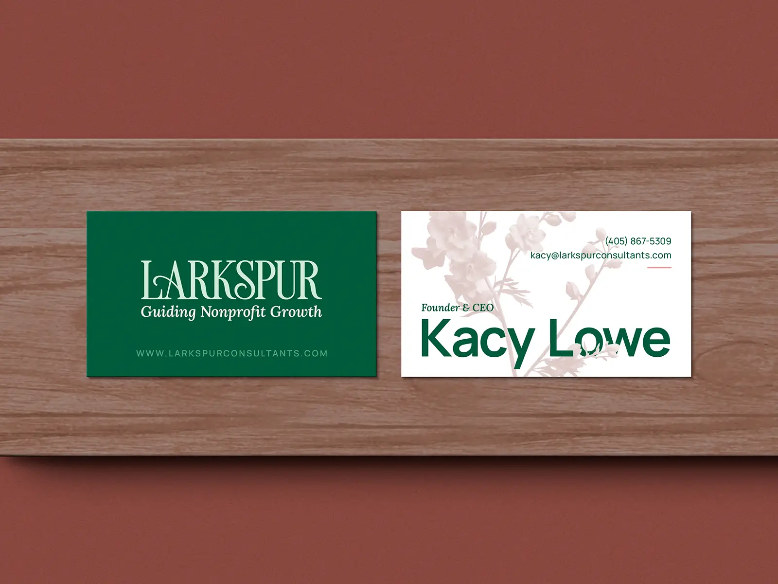
Larkspur is a brand new consulting firm, led by Kacy Lowe, a CFRE professional with over 20 years of experience. Larkspur helps align nonprofit teams so that they can raise more funds and make a lasting impact.

The Ask
When Kacy approached me, she hadn't picked a name just yet. She knew exactly what she wanted the business to be, but choosing a name is daunting. So, I took her through my Naming process, and we came up with Larkspur Consultants together. Then, I designed a complete Brand Identity, Website, and supporting Collateral to launch her business.

The Mark
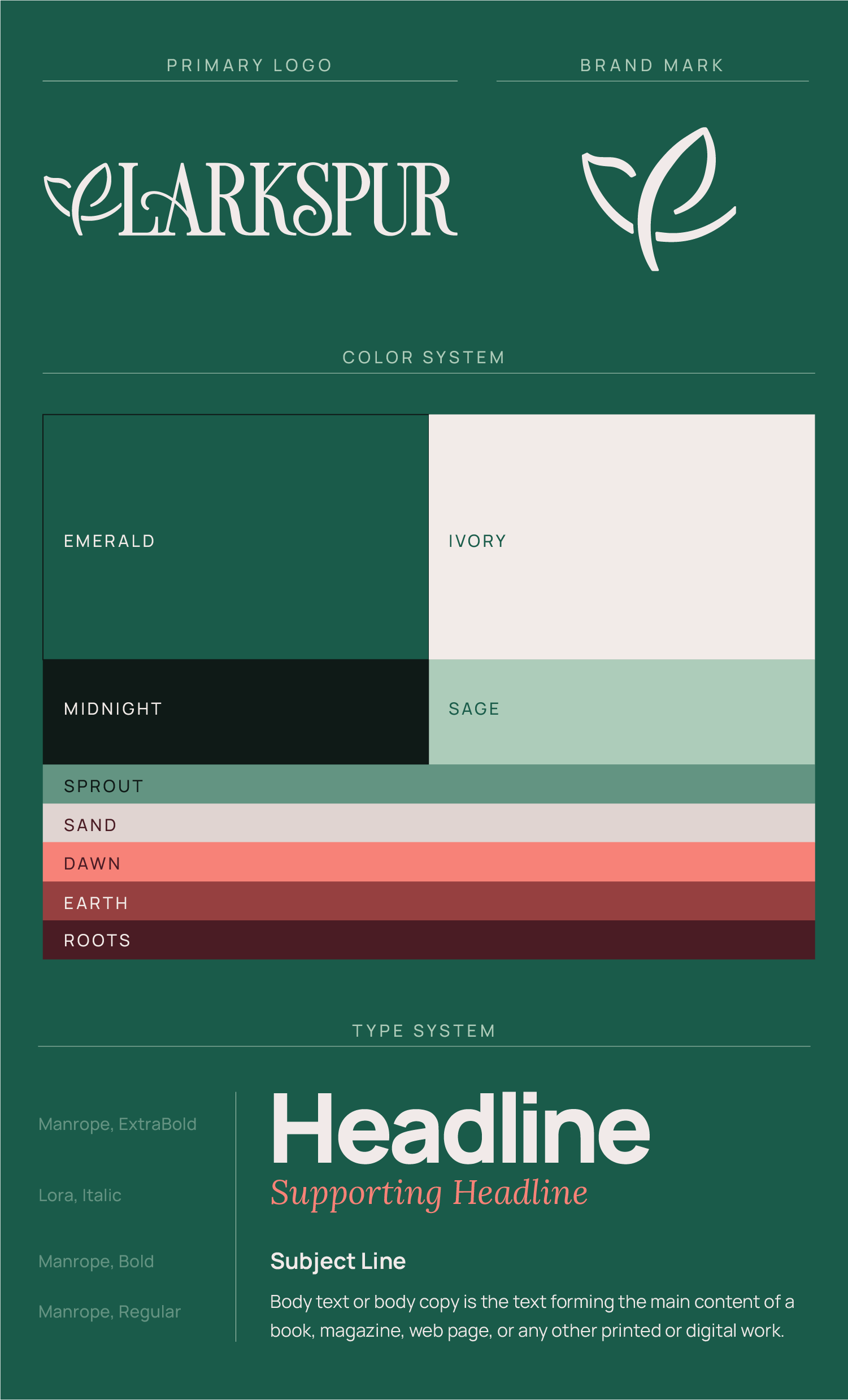
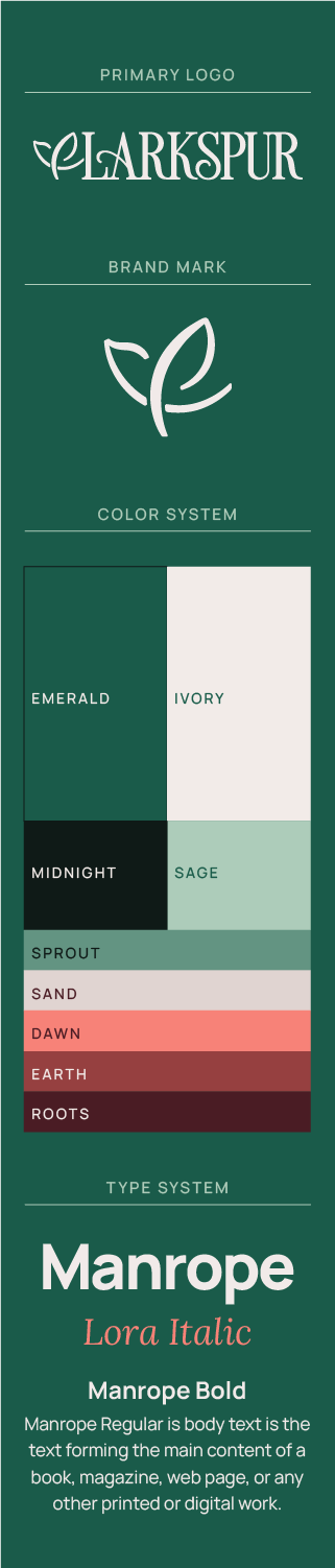
The Larkspur brand mark is an abstraction of both a bird in flight and a delphinium flower blooming. Larkspur petals are known for their asymmetry.
I formed the mark from perfect circles, but the asymmetrical stroke weights give it an organic flow and natural feeling. Then, I slightly rounded the stroke caps to mirror the brand's typeface.

Visual Translations
I used Ample Negative Space to evoke peace and clarity of purpose by removing clutter and creating room to breathe. Each form in use has high contrast. These thicks & thins add a little bit of drama and communicate confidence.
The connections made between forms represent unity and peaceful alignment. As each form stands alone, they are also clearly standing together. The organic forms of the Mark mirror Authenticity. Humanity is all about quirks and curves, “imperfections” are natural and beautiful.
The Name
The name Larkspur serves a few different purposes. First, it evokes an image. We can picture a bird in flight, prompted to move by something. Or, the flower itself (Larkspur is another name for Delphinium). Second, the name represents the idea of flourishing, a concept that motivates and inspires the owner, Kacy Lowe. Third, it's memorable and adaptable. Most nonprofit consultants use their own names as their business name, which can stymie their growth.
Larkspur are known to symbolize a beautiful spirit, swiftness, and positivity. All three of these concepts are central to the brand identity.
Brand Expressions
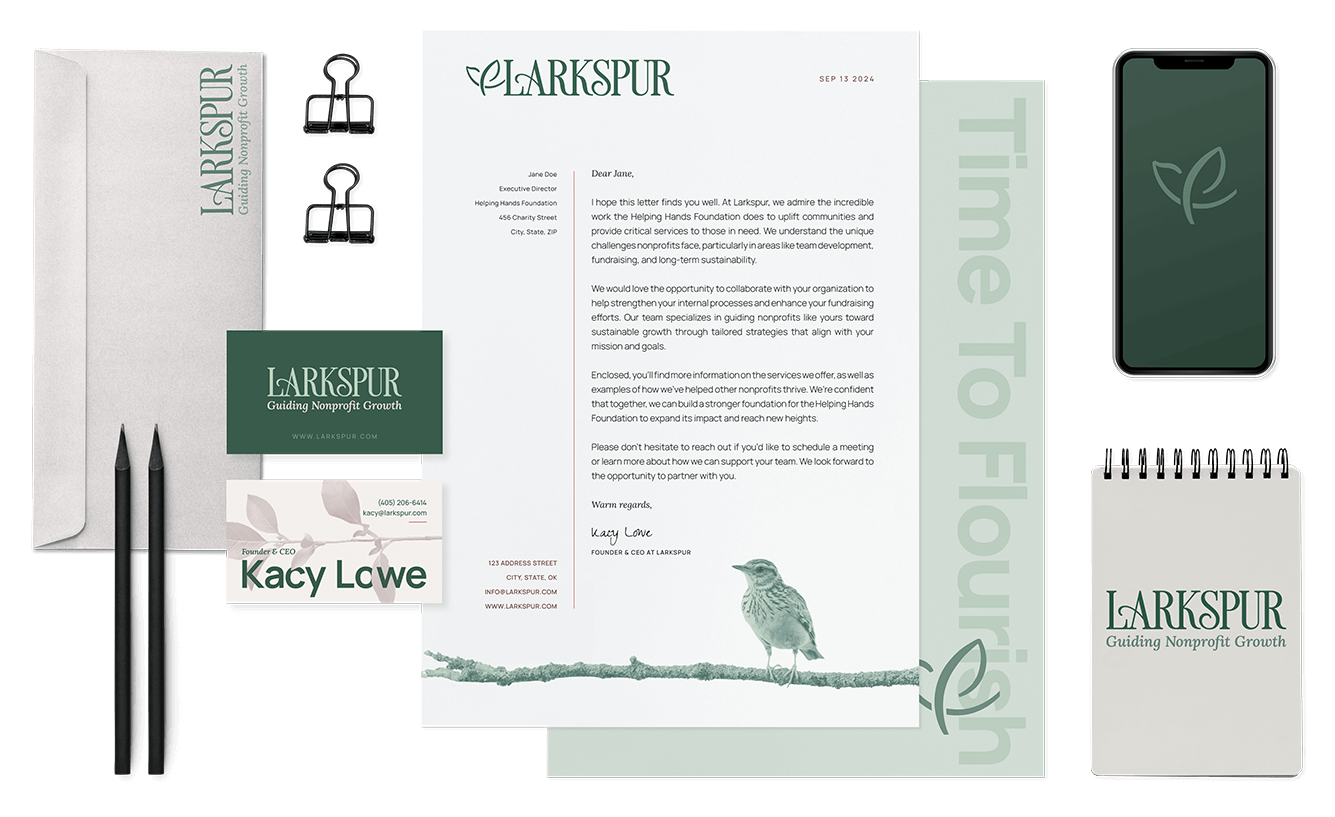
I used monotone images of flora and fauna, to bring a natural and organic touch to the brand. Overlaying minimal lines as borders and corner elements makes the brand feel modern and professional.
See Another One!

Now Offering
Drive Thru Design
Need Branding or Web Design Support? Hit the drive thru and book a short call and we'll troubleshoot it together!
Check it Out!