Background
This project won an American Advertising Award in 2024.
Teen Empower is a non profit organization that brings sexual health education to Oklahoma teenagers. Covering peer pressure, media messages, relationships, consent, and confidence, students learn how to take ownership over their health and wellness.


The Ask
After 20 years of serving Oklahoma, Teen Empower's brand identity no longer reflected the organization. Celebrating their 20th anniversary was the perfect reason to revisit the brand. They asked me for a brand that would capture all that they do, appealing to both of their audiences - adults and teenagers.
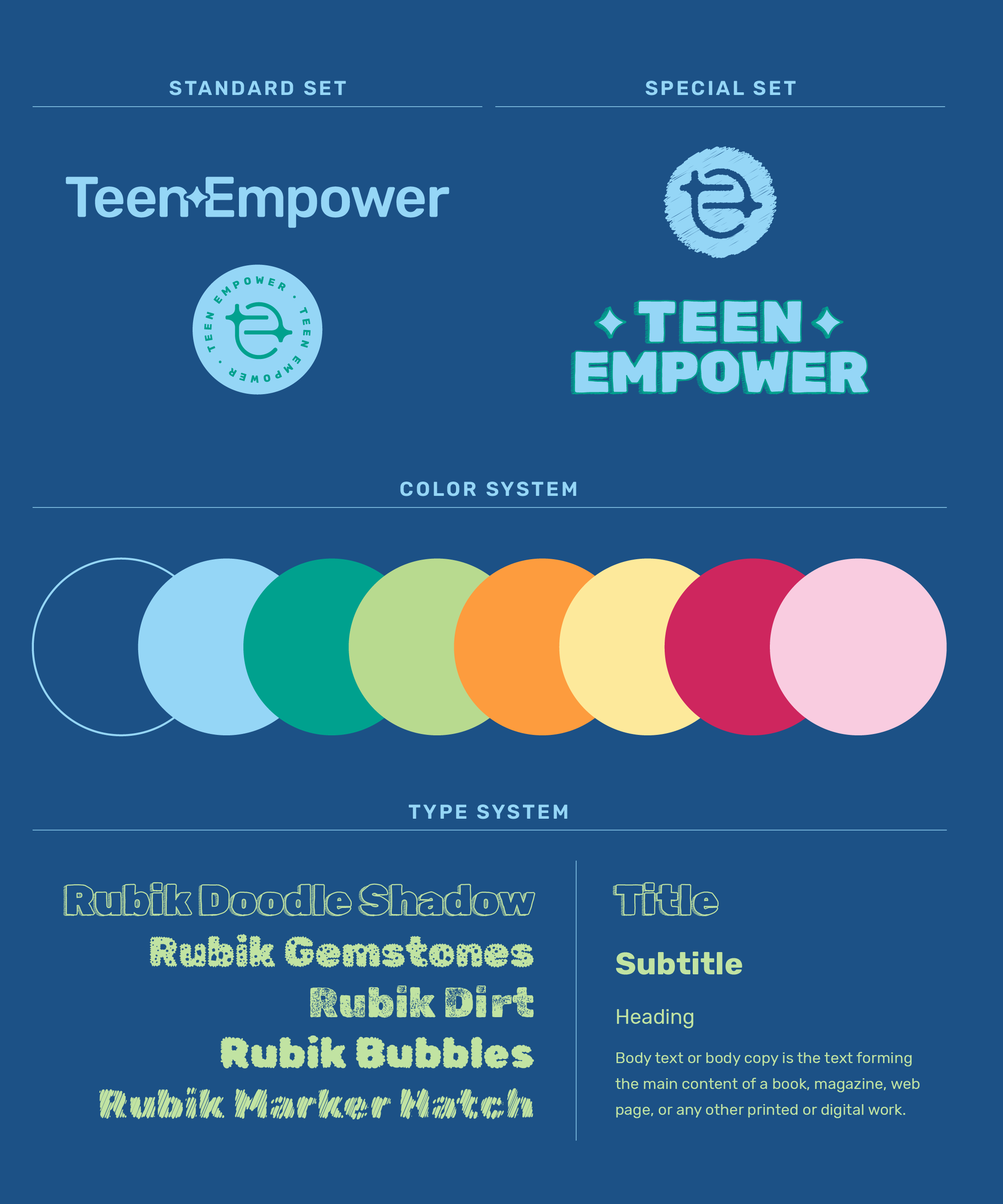
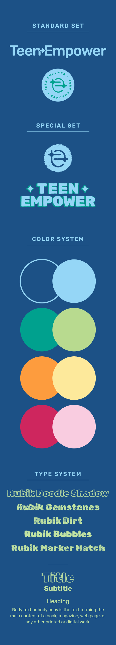

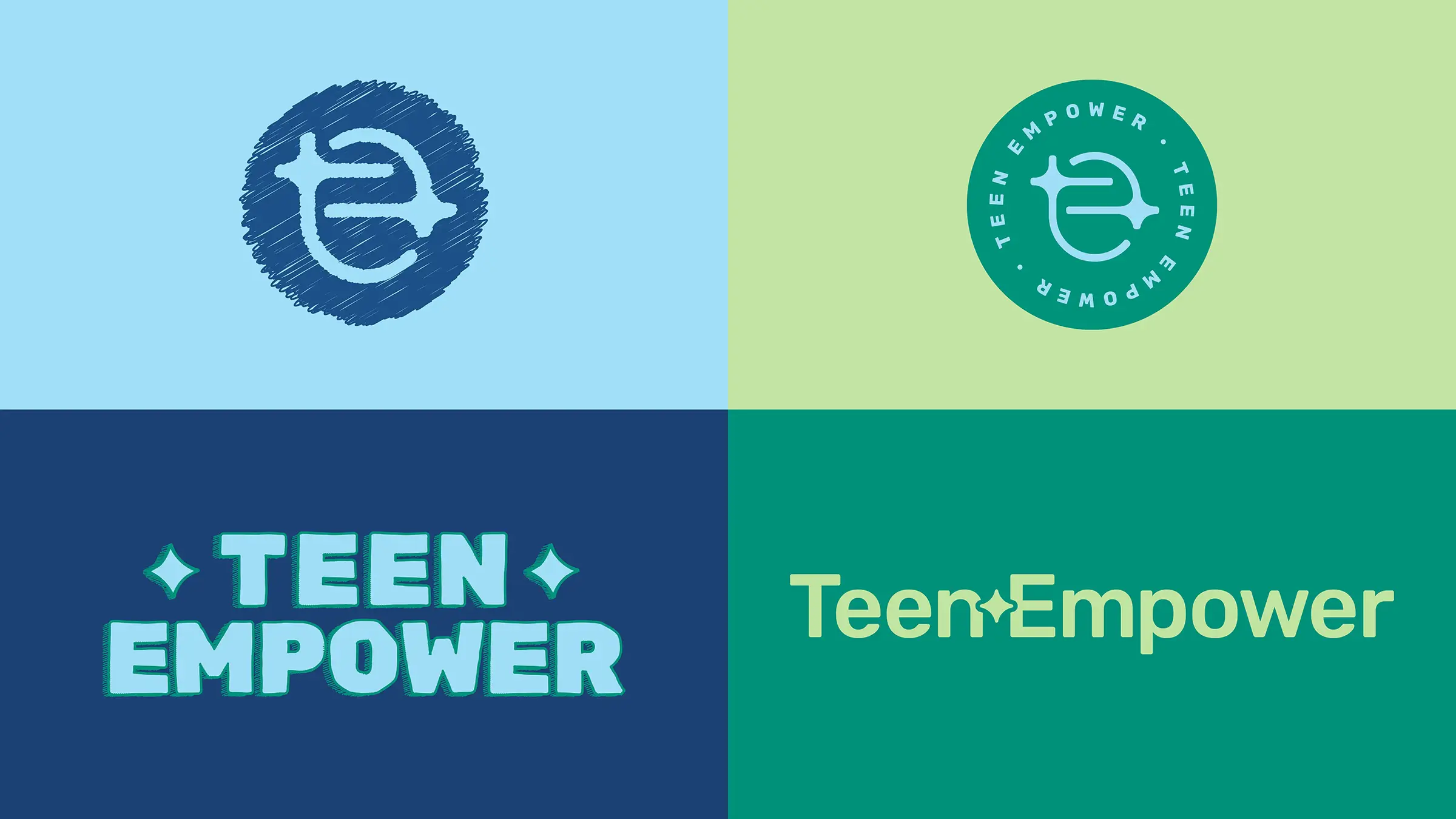
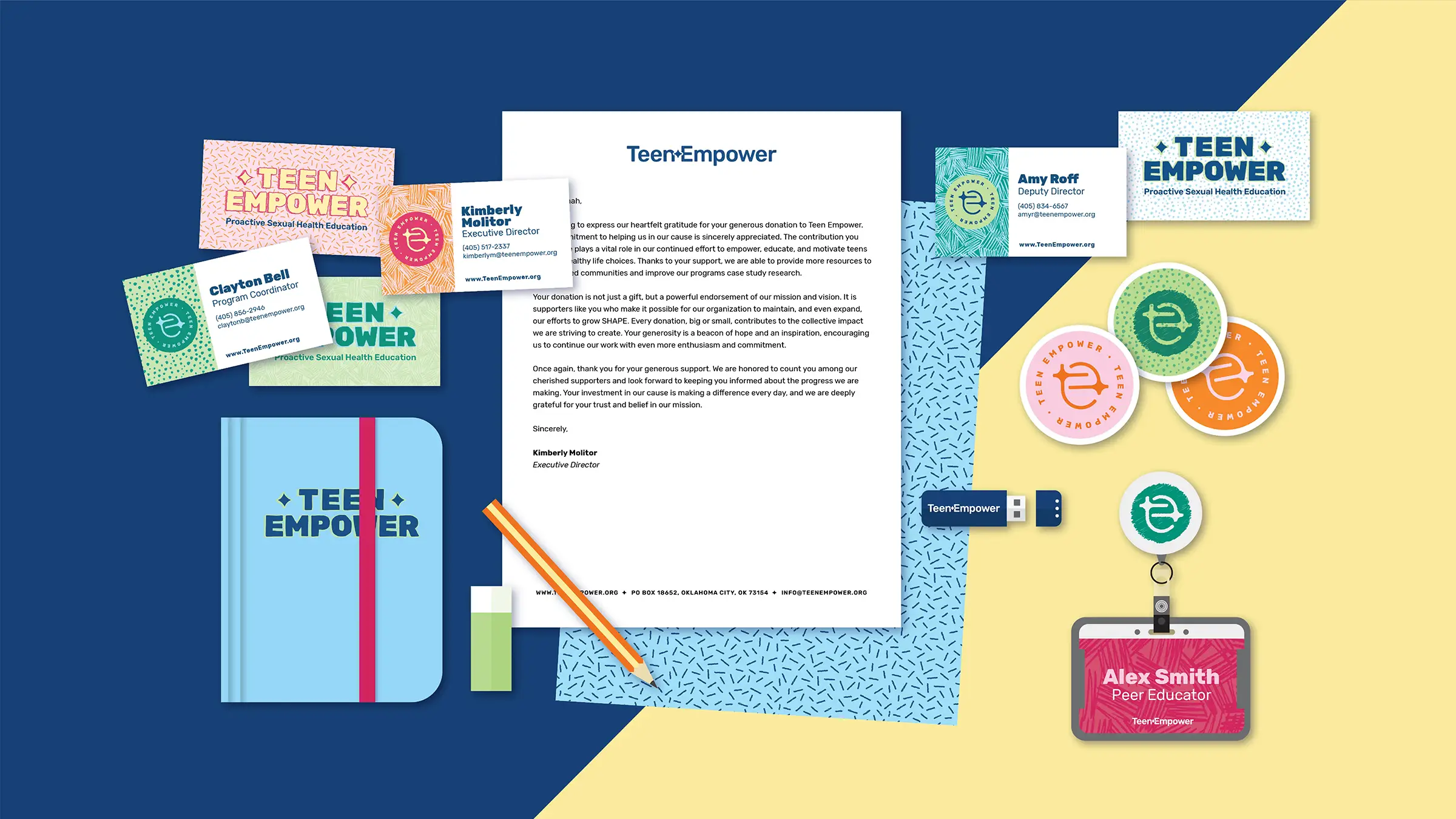
The Logos
To meet both audiences, I created two sets of logos.
These brand marks were designed to represent the organization's four core brand values: Courage, Compassion, Leadership and Respect. The star is used to show how Empowerment feels; being uplifted and looked up to just like stars in the sky. The star is also a symbol associated with great work, A+ grades, and exceeding expectations.
The padded intersection of form shows how Compassion feels; being supported by, connected to, and made whole by those around you. Bold strokes, thick letterforms, and emphasized typography show Courage; they are unabashedly present and hard to ignore. The upward angles of the standard mark show Leadership and Respect; guiding the eye upward and onward towards something better.
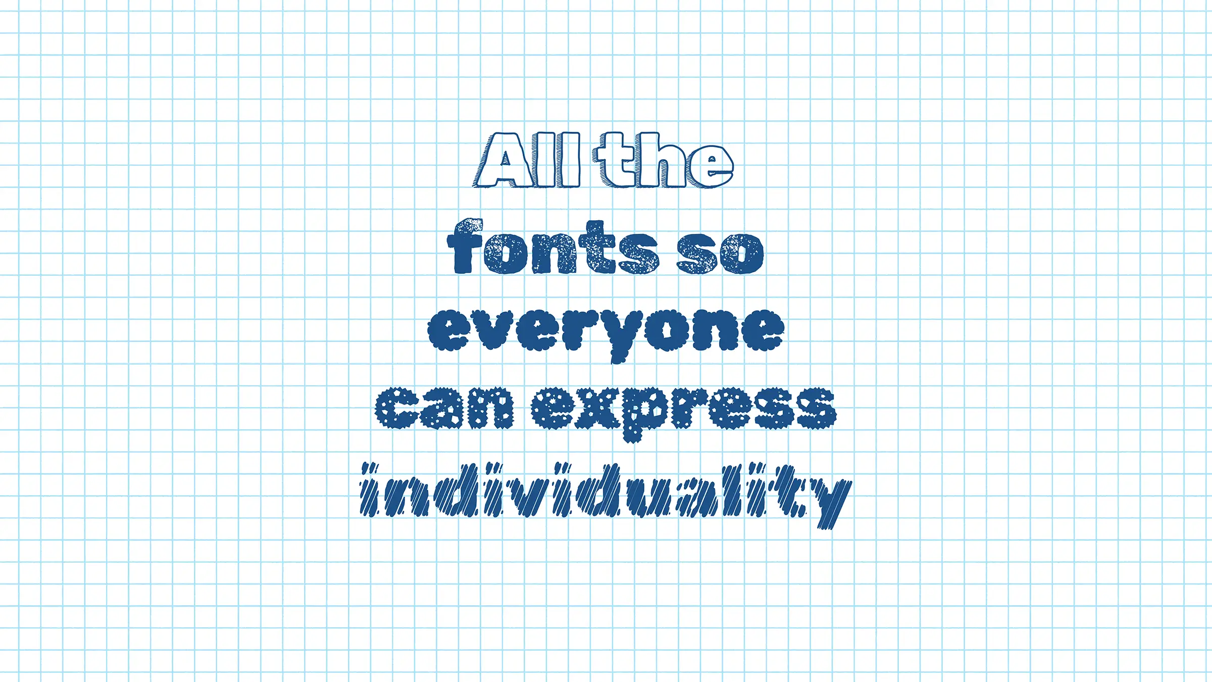
The Typography
I chose a robust type family, Rubik, to act as the brand's type system. Rubik comes with 14 weights, as well as 28 display style fonts to bring in the personality. We limited our selection to these 5 styles to ensure cohesion and readability. Each is reminiscent of hand-drawn letters, sketches, or quick doodles. The variety in these represents Community and the distinct voices within it, celebrating each.
Thematically, Rubik's geometric forms represent the organization's core values Openness and Community through simplicity. Without ornamentation, the letterforms are clear and unified through a singular stroke width. The slightly taller than average x-height represents Empowerment and Leadership by standing above others. These extended letterforms lead the eye and make a strong impression.
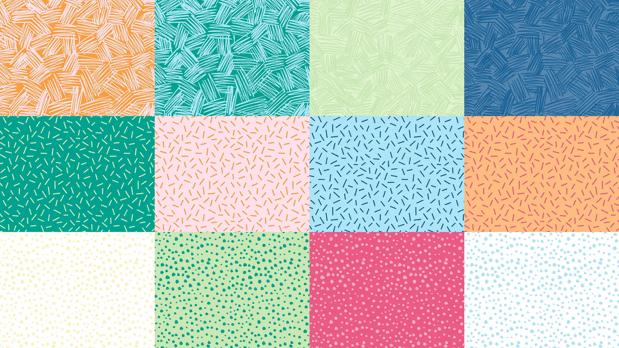
The Paper Pack
I also created a custom paper pack! It works to accentuate the brand, and are used to create marketing materials. Bringing in various textures and brand color combinations, these patterns can be used in all sorts of ways. The variety reflects community and the idea that each person within a community has a distinct personality.
See Another One!

Now Offering
Drive Thru Design
Need Branding or Web Design Support? Hit the drive thru and book a short call and we'll troubleshoot it together!
Check it Out!