Background
CoSpire Consulting is a national firm based in Oklahoma, partnering with purpose driven organizations across sectors and geographies. They bring clarity, courage, and a steady hand to lead organizations through change, growth, and challenges.
The Ask
I'm proud to have partnered with Andrea Fillmore, the Founder of Strategic Hype, on this rebrand! Andrea developed the strategy, and brought me in to develop the visual system, website, and supporting collateral. It was a highly collaborative project, and that made the end result that much stronger. The overall goal was to help CoSpire step into the next phase of growth as they become a nationally recognized brand.
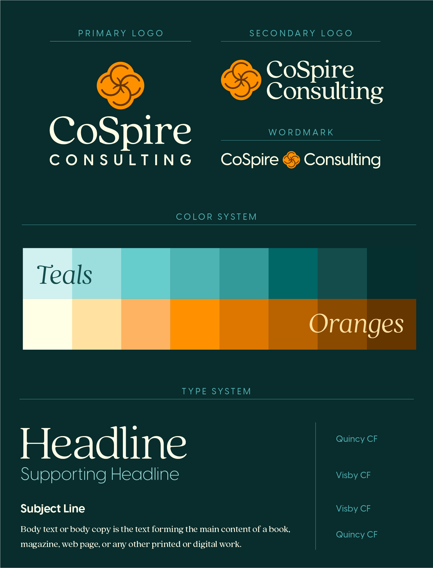
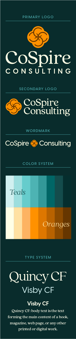
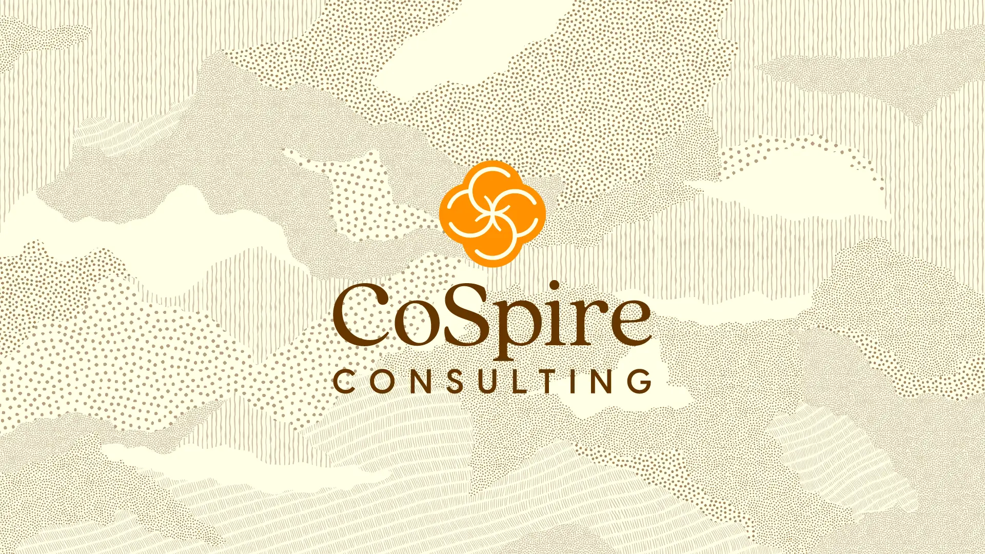
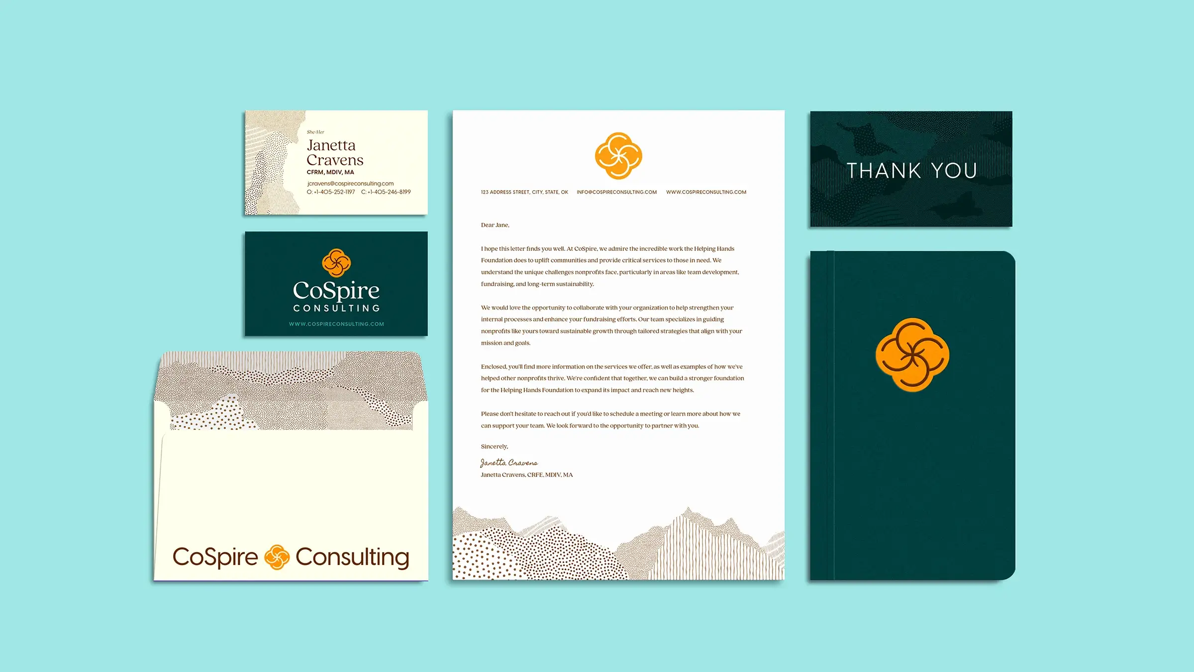
The Brand Mark
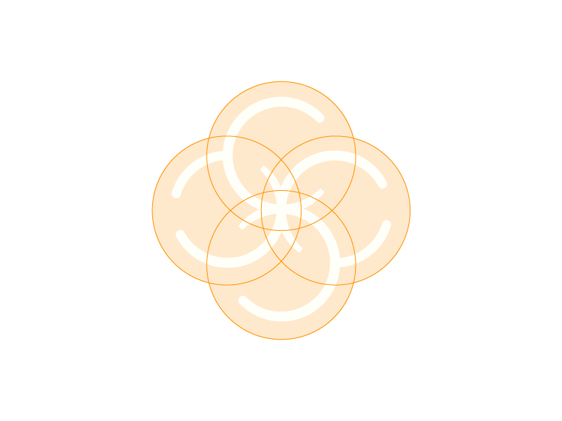
The Mark is a meditative journey for the eye to trace, bringing balance to the mind. Based on perfect overlapping circles, the mark a symmetrical mirroring of four C's alluding to an S. These interlocking and circular forms, represent their core values Community and Inclusion.
The primary typeface is a humanist serif with soft edges and organic forms bringing Creativity, Compassion, and Cultivation to mind. While the high contrast pairing of a serif and sans serif typeface is mirrored in the selection of bright, saturated hues from opposite sides of the color wheel. This creates a contrast driven color palette, representing Courage and Vitality.

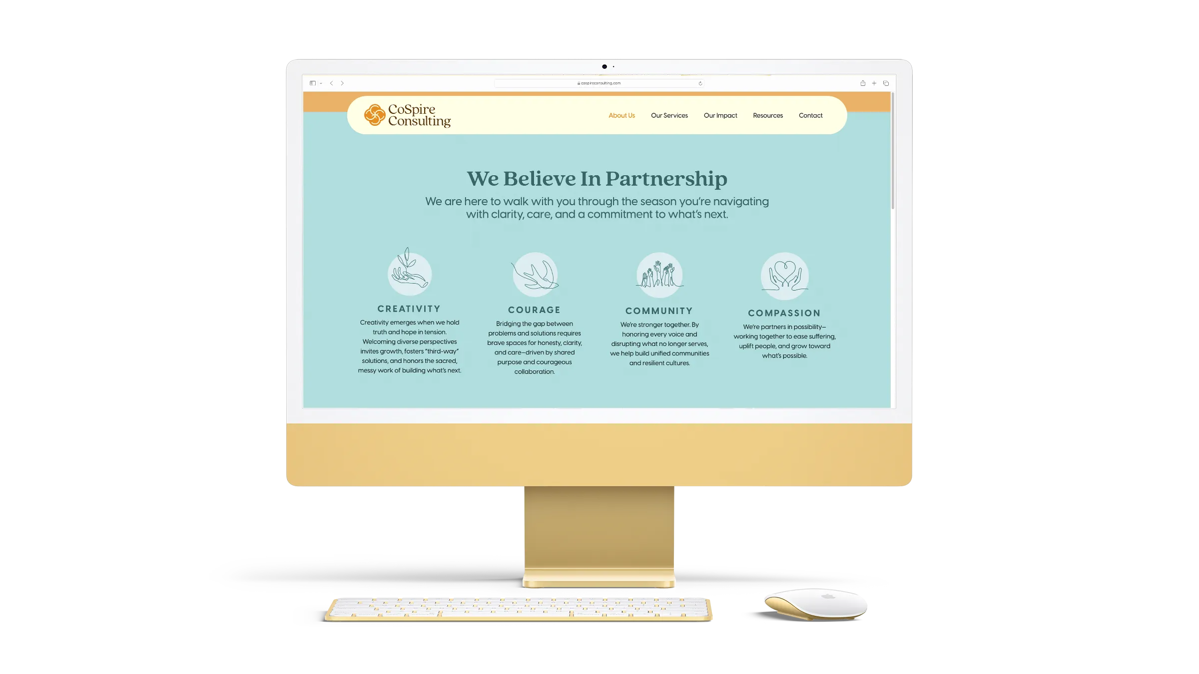
The Website
I designed and developed the website to reflect the brand identity in every way, including the intentional use of negative space to represent clarity, a core component of CoSpire.
Then, I spent a lovely afternoon conceptualizing and creating the following animations to bring the site to life. Each one is reflective of the core services CoSpire provides. Using a simple 9 circle grid, each one starts the same way, but brings a different idea to mind.
The Motifs
This motif system was inspired by Indonesian Batik, characterized by small, repetitive dot patterns. I used a variety of hand-drawn patterns to represent Community, showing how each voice is distinct yet working in harmony. They reflect human nature and nature itself, creating a beautiful tapestry of diversity.
The Organic application of these motifs represents the brand values Vitality, Creativity, and Inclusion. These hand-crafted patterns are applied in a few ways: a full bleed background, within a contained shape, or a live edge border element.
See Another One!
Now Offering
Drive Thru Design
Need Branding or Web Design Support? Hit the drive thru and book a short call and we'll troubleshoot it together!
Check it Out!